Risk of an event = Probability of the event happening × the consequensces of the event happening.1
To understand probability better, please read this and this.
This is the most basic definition of Risk. Risk = Probability, or how likely an event is to occur × Consequence, or impact. Because it is multiplicative, a high-probability event with low consequence (losing a pen) is low risk, and a low-probability event with catastrophic consequence (say, a nuclear exchange) can be high risk. The danger zone is where meaningful probability meets serious consequence.
History For most of history, people spoke about fate, luck, or divine will, not “risk” in a calculable sense. Hazards (storms, plagues, crop failures) were seen as acts of gods or nature. There was no notion of systematically measuring uncertainty.
In the 17th Century, A French nobleman, Chevalier de Méré, asked Blaise Pascal why some gambling bets worked better than others. Pascal’s correspondence with Pierre de Fermat (1654) is widely seen as the birth of modern probability theory.23 They developed early ideas of expected value – essentially, the mathematical ancestor of “probability × impact”.4
In the 18th Century, Daniel Bernoulli introduced the idea of utility in 1738:5 the insight that losing or gaining the same amount (£100) does not feel equally important to rich and poor people. This work planted the seeds for understanding why humans are risk‑averse and set the stage for later behavioural theories.
As trade, shipping and life insurance developed in the 18th–19th centuries, people started using probability tables to price the risk of death, shipwrecks and fire.6 This was the first large‑scale, institutional attempt to put numbers on everyday risks and pool them.6 Risk pooling is when lots of people chip in a little money into a shared pot (the “pool”) so that when one person has a big, unexpected cost (like a car accident or sickness), the money from the whole group covers it, making big losses manageable for individuals and premiums more stable for everyone.7 After industrialisation, wars and technological disasters, “risk” broadened from individual hazards (a ship sinking) to complex systems (nuclear power, financial markets, supply chains). The language of “risk management” emerged after the Second World War and matured through the later 20th century, culminating in general standards such as ISO 31000.89
Expected Value910 The mathematical heart of risk is Expected Value (EV). This is simply the average outcome if you repeated an action infinitely.
If a bet offers a 50% chance to win £100 and a 50% chance to lose nothing, the Expected Value is £50 ($0.50 \times 100 + 0.50 \times 0$). Rationally, you should pay anything up to £49.99 to take that bet.
But real life isn’t a casino with infinite replays. Humans often get only one shot. If an individual takes a risk with a positive expected value—like cycling to work to save money and improve health—but gets hit by a bus on day one, the “average” outcome is irrelevant. This is why variance matters as much as the average. A risk might look good on paper (high expected value) but have a “ruin condition” (a consequence you can’t recover from) that makes the math irrelevant.
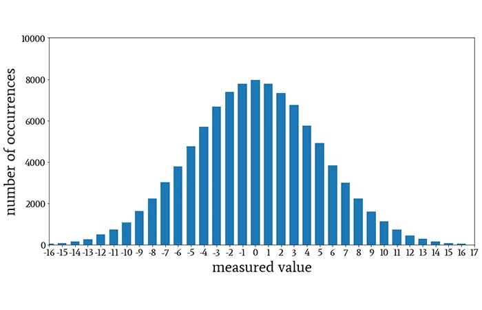
Normal Distribution If you measured the height of every single individual on the planet, or even a representative sample of them, the shape of that graph (often called “curve” in academic language) would be similar to this image:
This is the Normal Distribution (or Bell Curve), and it is the most important shape in risk management.12 It describes how randomness usually behaves. The very top of the hill represents the Mean (the average). This is what you “expect” to happen; in our stadium example, this is the average height (say, 5’9″). The vast majority of people will be average height, so their heights will be recorded as being clustered right around the middle.
If the Mean tells you where the peak is, Variance tells you how wide the hill is. It is a statistical measure showing how spread out a set of data points are from their average.13
Low Variance: Imagine a hill that looks like a needle. This means data points are tightly clustered. If you measured the height of 10,000 professional jockeys, the variance would be low—almost everyone is close to the average.14
High Variance: Imagine a hill that looks like a flattened pancake. This means data is widely spread out. If you measured the height of a random crowd containing jockeys and basketball players, the hill would be very wide.15
In risk management, mean tells you what usually happens; variance measures unpredictability and the potential for outcomes to be very different from the average, which is the essence of uncertainty.1617 A high variance means numbers are widely scattered, increasing the chance of both extreme positive and, crucially, extreme negative outcomes (losses).18 Low variance indicates they are clustered closely around the mean: it quantifies the dispersion or variability within a dataset.18 In the height data set, while most people would be average height, some people would be very short and others very tall as well. It’s just that the number of people who are not close to the average would fall off the farther away we get from the mean, or the middle of the bell curve.
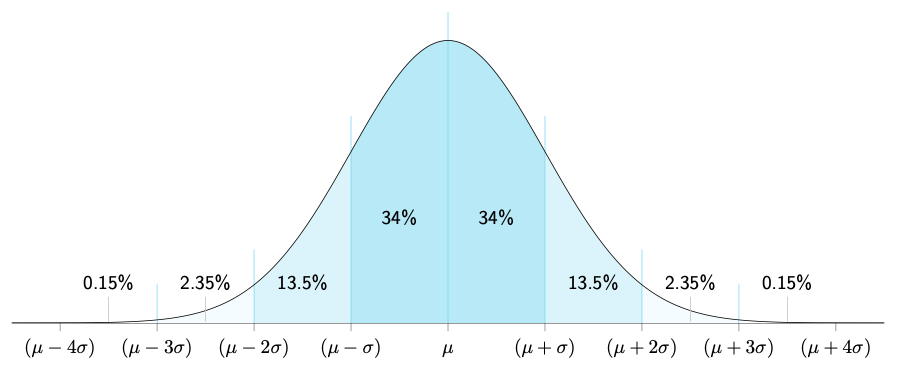
Normal Distribution divided into standard deviations distances from the mean.20
If Variance tells you the hill is “wide,” Standard Deviation (Sigma, or σ) tells you exactly how wide in real units. It is simply the square root of variance.
Think of Standard Deviation as the ruler for the Bell Curve.
1 Standard Deviation: In a normal distribution, about 68% of all outcomes happen within one standard deviation of the mean. If the average height is 5’9″ and the standard deviation is 3 inches, 68% of men are between 5’6″ and 6’0″.
2 Standard Deviations: Go out a bit further, and you capture 95% of all outcomes.
3 Standard Deviations: Go out three steps, and you capture 99.7% of everything.
In risk, when someone talks about a “Six Sigma” event (six standard deviations away from the average), they are talking about something so rare that it should theoretically almost never happen. And yet, in financial markets and complex systems, these “impossible” events happen surprisingly often.
Confidence2122 If a bank says, “We are 95% confident we won’t lose more than £1 million tomorrow,” they are essentially saying: “If tomorrow is a normal day (one of the 95%), we are safe. But if tomorrow is one of those rare, 1-in-20 bad days, all bets are off.”
In statistics, confidence is often explained using confidence intervals: at a 95% confidence level, the method used to build the interval would capture the true value about 95 times out of 100 repeated samples. That does not mean the true value has a 95% probability of being inside this specific interval; it means the procedure has 95% long-run reliability. This means, confidence intervals speak about frequency: how often do the unexpected or unwanted events happen. At 95%, they happen on any 5 days out of 100. at 99%, they happen once every 100 days.
For risk management, think of confidence levels as a dial for paranoia:
95% Confidence: You are planning for the normal bad days. You accept that on 1 day out of every 20 (roughly once a month), you will breach your limit.
99% Confidence: You are planning for the severe days. You only accept breaching your limit on 1 day out of 100 (roughly 2–3 times a year).
99.9% Confidence: You are planning for near-disaster. You only accept a breach once every 1,000 days (roughly once every 4 years).
The Micromort In the 1970s, Stanford professor Ronald Howard needed a way to compare diverse risks like skydiving, smoking, and driving. He invented the Micromort—a unit representing a one-in-a-million chance of death.23
This equalises different activities. Instead of vague fears (“is it safe to fly?”), we can use units:
1 Micromort is roughly the risk of driving 250 miles (400 km).24
1 Micromort is also the risk of flying 6,000 miles (9,600 km).24
Remanufacturing is a structured industrial process where a used product (the “core”) is disassembled, cleaned, inspected, repaired or upgraded, and reassembled to at least “as‑new” performance, often with a new warranty. It differs from simple repair (which restores function) and recycling (which recovers materials) by preserving the value embedded in complex components like housings, castings, and precision parts.1
In circular economy terms, remanufacturing is one of the highest‑value loops because it keeps products in use with minimal additional material and energy input. That makes it strategically attractive in sectors where products are capital intensive, long‑lived, and technically durable—think engines, industrial equipment, medical devices, and high‑end electronics.2
Remanufacturing reduces exposure to volatile raw material prices and supply disruptions, a growing concern highlighted in circular economy policy discussions by conserving the bulk of materials in complex products3and reports indicate that remanufacturing can cut greenhouse gas emissions by two-thirds or more compared with producing new parts, making it economically attractive for firms facing carbon constraints or reporting obligations.4 This is why policies that push producers to take responsibility for products at end‑of‑life (through take‑back schemes or design requirements) naturally encourage remanufacturing models as they can extract more value from returned goods.45
Economics The economics is all about the margins for organisations:
Cost side
Production cost savings: Many empirical and industry studies show remanufacturing can reduce unit production costs by roughly 40–65% compared with making a new product, mainly by reusing major components and cutting material and energy demand. Industry examples like Caterpillar’s “Cat Reman” report remanufactured parts costing 45–85% less to produce than brand‑new equivalents while meeting the same specifications.6
Customer price level: Remanufactured products are typically sold at 60–80% of the price of new products, attractive enough to win price‑sensitive customers while still leaving room for solid margins.7
Resource and energy savings: Preserving existing components means far less raw material and process energy; some studies and industrial programs report 65–87% cuts in energy use and greenhouse gas emissions relative to new manufacture.8
Cost Structures
Predictable core supply, stable technical yield, and cost‑efficient operations are the most important factors in any business working in the remanufacturing sector. These can be divided into three main factors, which are then further subdivided as shown in the list below:
Core acquisition and collection: Remanufacturers must get used products back, through buy‑back programs, deposits, leasing, or authorised channels (approved distribution or collection pathways), which adds logistics, handling, and sometimes incentives to the cost base.9 Economic models and case studies show that profitability is highly sensitive to the “core return rate”: low or erratic returns undermine capacity utilisation and can drive up unit costs.10 Interestingly, research on “seeding” (deliberately placing additional new units into the field to increase future cores) finds that active management of core flows can increase total remanufacturing profits by around 20–40%10 in some product lines: this means the business depends on both- active new sales, and a specific life of the products which are being sold.
From an economic perspective, the supply of cores is not an exogenous input but an intertemporal decision variable. New products placed into the market today become the core inventory available for remanufacturing in the future, linking current sales decisions to future production capacity. Formal models show that firms may rationally increase new product sales, adjust leasing terms, or subsidise returns in order to secure a predictable flow of future cores, even when short-term margins are lower. The profitability of remanufacturing therefore depends on managing a stock of recoverable products over time rather than on one-period cost comparisons. When core returns are volatile or poorly controlled, remanufacturing capacity cannot be fully utilised. Unit costs rise and the apparent economic advantage shrinks, even if average cost savings look attractive on paper.
Core quality and yield: Not all returned products are economically remanufacturable; if too many cores fail inspection or require heavy rework, the effective cost advantage shrinks.10 Models that combine technical constraints with cost and collection rates show that limited component durability and uncertain core quality can make remanufacturing unprofitable unless screened and priced correctly.11
A further economic complication is uncertainty. Unlike new manufacturing, where inputs are standardized, remanufacturing faces stochastic variation in both core quality and remanufacturing cost. Inspection and testing therefore act as economic screening investments rather than mere technical steps: firms incur upfront costs to reveal information about whether a core should be remanufactured, downgraded, or scrapped. Economic models frame this as an option-value problem, where remanufacturing decisions are deferred until uncertainty is resolved. Even when average remanufacturing costs are low, high variance in core condition can reduce expected profits and lead firms to reject a substantial share of returns. This helps explain why observed remanufacturing volumes are often lower than simple cost‑savings calculations would predict.
Process Complexity: Disassembly, inspection, testing, and reassembly require specialised skills and flexible processes, which can raise overhead relative to straight‑through new manufacturing.12
Overheads: Since remanufacturing has extra process steps (process complexity), overhead is often a larger share of total cost than in straightforward new manufacturing.13
Revenue side
Margin structure: If a new product sells for 100 monetary units and costs 70 to make, the margin is 30; a remanufactured equivalent might sell for 70–80 and cost only 30–40, producing a margin in the same range or better.6
New customer segments: Lower price points allow firms to address more price‑sensitive markets, geographies with lower purchasing power, or customers who would otherwise buy used or off‑brand products.9
A central economic tension in remanufacturing is cannibalisation: every remanufactured unit sold potentially displaces a sale of a new product. Economic models consistently show, however, that remanufacturing can increase total firm profit when it functions as a form of price discrimination rather than simple substitution. By offering a lower-priced remanufactured product, firms can capture demand from customers with lower willingness to pay who would otherwise buy used, grey-market, or competitor products, while preserving higher margins on new products for less price-sensitive customers. In this equilibrium, remanufactured products expand the market rather than erode it, provided the price gap between new and remanufactured goods is carefully managed. This logic explains why OEMs often restrict remanufacturing volumes or channels even when unit margins are attractive: the optimal remanufacturing rate is determined not by production cost alone, but by its interaction with new-product pricing and demand segmentation.
Market Structures At the moment, remanufacturing markets tend to be fragmented and dominated by many small third‑party firms, with pockets of oligopoly or even monopoly power (A monopoly is a market structure where one firm dominates the entire market supply, and an Oligopoly is a market structure with only a few suppliers in the market rather than many) around strong brands and OEM‑controlled (OEM = Original Equipment Manufacturer) take‑back systems. The exact structure depends on who remanufactures (OEM vs independent), how products are collected, and how new and remanufactured products compete in closed‑loop supply chains.1415
From an industrial-economics standpoint, the persistence of fragmented remanufacturing markets reflects the shape of remanufacturing cost curves. While new manufacturing often exhibits strong economies of scale, remanufacturing benefits from scale only up to a point. Input heterogeneity, variable inspection effort, and the need for flexible processes limit the gains from large-scale standardisation. As volume increases, coordination and screening costs rise, flattening the cost curve and reducing the competitive advantage of very large firms. These structural features help explain why remanufacturing markets tend to support many small and mid-sized firms alongside selective OEM participation, rather than converging toward high concentration.
In remanufacturing, market structure is usually discussed along three dimensions:16
Industry concentration: how many firms remanufacture a given product, and how large the biggest players are.
Vertical structure in the closed‑loop supply chain: which tiers (OEM, retailer, specialist remanufacturer, collector) perform remanufacturing and who controls access to cores (used products).
Horizontal competition: how new and remanufactured products compete (prices, perceived quality, channels), often modeled with monopoly, duopoly or oligopoly game‑theoretic frameworks.
These structures are shaped by cost savings from remanufacturing, consumer valuation of remanufactured products, regulatory pressure, and how easy it is to access used products (cores).
Empirical industry structures16 Across sectors such as automotive parts, industrial machinery, electronics and heavy equipment, studies and market reports converge on a broadly fragmented structure with a long tail of small non‑OEM remanufacturers and a smaller number of large OEMs and global service providers.
Key empirical patterns:
Automotive parts: global automotive parts remanufacturing is characterised as fragmented, with many regional and local remanufacturers, plus major OEM programs (e.g., engines, gearboxes, turbochargers).17
Industrial machinery and heavy equipment: growth is strong, but the market still has many specialised firms; OEMs, dealer networks and third‑party remanufacturers often coexist, sometimes in parallel closed‑loop chains.18
Overall EU/US picture: an EU‑level study notes a skewed structure with “a significant number of smaller non‑OEMs” and relatively few large OEM‑affiliated remanufacturers.
This leads to typical hybrid structures:
Many small firms competing in price and service quality for commodified parts.
Local monopolies around niche technologies or proprietary know‑how.
Regional oligopolies in popular product lines (e.g. certain automotive components).
What’s happening in India? India’s remanufacturing story is still nascent and uneven, but it is being pushed forward indirectly by waste‑management laws, Extended Producer Responsibility (EPR) rules for e‑waste, plastics and batteries, and the historic strength of the kabadiwala / scrap‑dealer ecosystem. Most circular‑economy action on the ground still looks like repair, reuse and informal recycling rather than full OEM‑style remanufacturing, yet the latest e‑waste rules and their refurbishing‑certificate mechanism create legal hooks that remanufacturing‑type businesses can use.19 India doesn’t yet have a “Remanufacturing Act”, but multiple waste rules create incentives and legal categories that overlap with remanufacturing.
Put legal responsibility on producers, manufacturers, refurbishers and recyclers of listed electrical and electronic equipment to meet quantified EPR targets for e‑waste, using a central online portal.
Require all these actors (including refurbishers) to register on the CPCB EPR portal, report flows of products and e‑waste, and obtain authorisations before operating.
Explicitly recognise refurbishing as a distinct activity: registered refurbishers can extend the life of products, send any residual e‑waste only to registered recyclers, and generate refurbishing certificates that allow producers to defer part of their EPR obligation into later years.
The 2024 Amendment Rules keep the 2022 structure but tune how the system actually works:
They add a new rule 9A that lets the central government relax timelines for filing returns “in public interest or for effective implementation”, acknowledging practical compliance bottlenecks.
They refine definitions (including “dismantler”) and insert new sub‑rules in rule 15 that allow the government to create platforms for exchange/transfer of EPR certificates and empower CPCB to set floor and ceiling prices for those certificates, tying prices to environmental‑compensation logic.
That last bit is important: it means refurbishing and recycling certificates now sit inside a semi‑regulated compliance market, rather than in a completely opaque bilateral space. For any firm doing serious refurbishment or remanufacturing of electronics, the financial value of each “saved” device is no longer just the resale price; it also includes the value of refurbishing certificates producers will need to meet their EPR targets.
One of my favourite things about waste management in India is the local kabadiwala (waste-person) system, where a person who runs a reverse-logistics business comes to people’s homes and BUYS the waste they wish to remove from their homes. The kabadiwala networks that move e‑waste and scrap in cities haven’t changed because of the 2024 amendment—but the way the state talks about integrating them has become more concrete.
Official statements on the 2022 rules repeatedly say the new EPR regime is meant to “channelize the informal sector to the formal sector”, by making collection and processing possible only via registered producers, refurbishers and recyclers.21 Circular‑economy concept notes for municipal waste still highlight that informal workers and kabadiwalas do the heavy lifting of collection and separation, and must be integrated into contracts, data systems and formal infrastructure.22 Case studies on informal e‑waste collectors (kabadiwalas) emphasise that they remain the primary collection channel for household e‑waste, but usually sell to small dismantlers who operate outside the 2022–2024 EPR framework.23
Against that backdrop, the 2022–2024 e‑waste regime offers two big levers for integration:
Partnerships between registered refurbishers/recyclers and kabadiwala networks: the law doesn’t mention kabadiwalas by name, but nothing stops a registered refurbisher from building sourcing and sharing arrangements with informal collectors, bringing their material into the formal portal system.24
Data and platform logic: the new certificate‑trading platforms and CPCB portals are building a data spine for reverse logistics; if cities and social enterprises plug informal actors into that spine, kabadiwalas become the front‑end of a traceable, compliance‑generating remanufacturing pipeline instead of sitting outside it.25
In practice, though, most of what happens today is still repair, cannibalisation for parts, and low‑value recycling. The regulatory architecture is now sophisticated enough to support high‑value remanufacturing and refurbishment at scale, but the hard work is social and institutional: defining quality standards, building trust in “remanufactured” products, and finding ways to bring kabadiwalas and other informal workers into those new value chains without erasing their livelihoods.
Note: I know this is quite technical, but it’s about accounting, so that’s natural. Financial accounting tends to be technical too, right?
The ISO 14064 series is a family of international standards by the International Organization for Standardization (ISO) for quantification, monitoring, reporting, and verification of GHG emissions. They were developed by Technical Committee ISO/TC 207 on Environmental Management, Subcommittee SC 7 on Greenhouse Gas Management, can be adopted across different sectors, regions, and organisational types.
The ISO 14064 series currently comprises four main parts:
ISO 14064-1:2018 – “Greenhouse gases – Part 1: Specification with guidance at the organisation level for quantification and reporting of greenhouse gas emissions and removals.” This standard enables organisations to measure and report their total greenhouse gas emissions and removals.
ISO 14064-2:2019 – “Greenhouse gases – Part 2: Specification with guidance at the project level for quantification, monitoring and reporting of greenhouse gas emission reductions or removal enhancements.” This standard applies to specific projects designed to reduce emissions or enhance carbon removals, such as renewable energy installations, energy efficiency retrofits, reforestation programs, or methane capture projects.
ISO 14064-3:2019 – “Greenhouse gases – Part 3: Specification with guidance for the verification and validation of greenhouse gas statements.” This standard provides the framework for independent third-party verification and validation of GHG claims. It is the assurance mechanism that gives stakeholders confidence in reported emissions data.
ISO/TS 14064-4:2025 – “Greenhouse gases – Part 4: Guidance for the application of ISO 14064-1.” This newest addition, published in November 2025, is a Technical Specification that provides practical, step-by-step guidance for implementing ISO 14064-1. It bridges the gap between the normative requirements of the standard and real-world application, with detailed examples and case studies for different organisational types and sectors.
Additionally, the broader ISO 14060 family includes ISO 14065:2020 (requirements for bodies validating and verifying GHG statements), ISO 14066:2023 (competence requirements for verifiers and validators), and ISO 14067:2018 (carbon footprint of products).
This ecosystem of standards creates a framework:
Organisations use ISO 14064-1 and 14064-4 to calculate their emissions;
Project developers use ISO 14064-2 to quantify project benefits;
Independent verifiers use ISO 14064-3 to audit these claims; and a
Accreditation bodies use ISO 14065 and 14066 to ensure the competence and impartiality of the verifiers themselves.
The Five Core Principles
Relevance: Select the GHG sources, GHG sinks, GHG reservoirs, data and methodologies appropriate to the needs of the intended user.
Completeness: Include all relevant GHG emissions and removals.
Consistency: Enable meaningful comparisons in GHG-related information.
Accuracy: Reduce bias and uncertainties as far as is practical.
Transparency: Disclose sufficient and appropriate GHG-related information to allow intended users to make decisions with reasonable confidence.
As stated explicitly in ISO 14064-1, “The application of principles is fundamental to ensure that GHG-related information is a true and fair account. The principles are the basis for, and will guide the application of, the requirements in this document”.
Relevance: Appropriateness to User Needs This principle recognises that GHG inventories and reports serve specific purposes and must be designed to meet the needs of those who will rely on the information to make decisions.
Relevance begins with clearly identifying the intended users of the GHG inventory and understanding their information needs. Intended users may include the organisation’s own management, investors, lenders, customers, regulators, GHG programme administrators, or other stakeholders. Different users may have different information needs. For example, investors may focus primarily on climate-related financial risks and opportunities, while regulators may require specific emissions data for compliance purposes.
The relevance principle requires organisations to make appropriate boundary decisions (determining which operations, facilities, and emissions sources to include in the inventory based on what is material and meaningful to intended users): an inventory that excludes significant emission sources or includes irrelevant information fails to serve user needs effectively.
In practice, applying the relevance principle means that organisations must engage with their stakeholders to understand what information they need and why, design inventory boundaries and methodologies to provide this information, focus effort on quantifying the most significant emissions sources, and regularly reassess whether the inventory continues to meet user needs as circumstances change.
Completeness: Including All Relevant Emissions The completeness principle requires organisations to include all relevant GHG emissions and removals within the chosen inventory boundaries. This principle ensures that GHG inventories provide a comprehensive picture of an organisation’s climate impact rather than selectively reporting only favorable information.
Completeness operates at multiple levels. At the broadest level, it requires that organisations establish appropriate organisational and reporting boundaries and then include all sources and sinks within those boundaries. For organisational-level inventories under ISO 14064-1, this means accounting for all facilities and operations that fall within the defined organisational boundary, whether based on control or equity share. It also means including both direct emissions from sources owned or controlled by the organisation and indirect emissions that are consequences of organisational activities.
The 2018 revision fundamentally changed how organizations handle indirect emissions. Instead of treating “Scope 3” as a monolithic category, ISO now requires systematic evaluation across six specific categories. This shift reflects reality: a manufacturer’s supply chain emissions (Category 4) and product use-phase emissions (Category 5) are fundamentally different and require different strategies. Organisations must systematically identify potential sources of indirect emissions throughout their value chains and include those that are determined to be significant based on magnitude, influence, risk, and stakeholder concerns. The real problem here is data availability: an organisation might know its own production emissions precisely, but will struggle to get Scope 3 data from thousands of distributors, and this makes implementation messy and imprecise.
An important aspect of completeness is the treatment of exclusions. If specific emissions sources or greenhouse gases are excluded from the inventory, ISO 14064-1 requires organisations to disclose and justify these exclusions. Justifications must be based on legitimate reasons such as immateriality, lack of influence, or technical measurement challenges, not simply on a desire to report lower emissions.
For GHG projects under ISO 14064-2, completeness requires identifying and quantifying emissions and removals from all relevant sources, sinks, and reservoirs affected by the project, including controlled, related, and affected SSRs. Failure to account for emission increases from affected sources (often called leakage) would result in overstatement of project benefits.
Consistency: Enabling Meaningful Comparisons The consistency principle requires that organisations enable meaningful comparisons in GHG-related information over time and, where relevant, across organisations. Consistency is essential for tracking progress toward emission reduction targets, assessing the effectiveness of mitigation initiatives, and enabling external stakeholders to compare performance across organisations or sectors.
Consistency has several dimensions. It requires using consistent methodologies, boundaries, and assumptions over time when quantifying and reporting emissions. When an organisation measures its emissions in one year using specific methodologies and emission factors, it should apply the same approaches in subsequent years to enable valid comparisons.
It is important to note that consistency does not mean organisations can never improve their methodologies or expand their boundaries. Organisations may and should refine their approaches over time to improve accuracy, expand scope, or respond to changing circumstances. However, when such changes occur, consistency requires transparent documentation of what changed and why, recalculation of prior years where necessary to maintain comparability, and clear explanation in reports so users understand the nature and impact of changes.
Case in point, the base year concept embodied in ISO 14064-1 is central to applying the consistency principle. Organisations select a specific historical period as their base year against which future emissions are compared. The base year serves as the reference point for measuring progress toward reduction targets. ISO 14064-1 requires organisations to establish policies for recalculating base year emissions when significant changes occur to organisational structure, boundaries, methodologies, or discovered errors. These recalculation policies ensure that year-over-year comparisons remain valid even as organisations evolve.
The recalculation policy is most commonly triggered by three types of organisational change. First, structural changes: acquisitions, divestitures, or mergers that materially alter the scope of operations. ISO 14064-1 and the GHG Protocol typically define “material” as changes exceeding 5% of Scope 1 and Scope 2 emissions in the base year. For example, if a retail company acquires a logistics provider representing an additional 6% of historical emissions, the base year must be recalculated to include that logistics provider, enabling fair year-on-year comparison. Second, methodology improvements: when an organisation discovers better data or more appropriate emission factors. If a facility previously used regional electricity emission factors but gains access to grid-specific data, or if a company previously estimated employee commuting emissions using averages but now collects actual commute data, these improvements warrant recalculation. The driver is not change for its own sake, but the principle that prior years should benefit from improved accuracy just as current years do. Third, discovered errors: when an organisation identifies that prior-year calculations were systematically wrong—either over or understating emissions—recalculation is not optional; it is mandatory. Transparency requires disclosing both the error and its magnitude, then correcting the historical record. Organisations often establish a threshold (commonly 5%) below which minor corrections do not trigger full recalculation; instead, they are noted as adjustments in the current year.
Accuracy: Reducing Bias and Uncertainty Accuracy involves reducing systematic bias and reducing uncertainty.
Systematic bias occurs when quantification methods consistently overstate or understate actual emissions. For example, using an emission factor that is inappropriately high or low for the specific activity being quantified would introduce bias. The accuracy principle requires ensuring that quantification approaches are systematically neither over nor under actual emissions, as far as can be judged.
Uncertainty refers to the range of possible values that could be reasonably attributed to a quantified amount. All emission estimates involve some degree of uncertainty arising from measurement imprecision, estimation methods, sampling approaches, lack of complete data, or natural variability. The accuracy principle requires reducing these uncertainties as far as is practical through using high-quality data, appropriate methodologies, and robust measurement and calculation procedures. ISO 14064-1 requires organisations to assess uncertainty in their GHG inventories, providing both quantitative estimates of the likely range of values and qualitative descriptions of the causes of uncertainty. This assessment helps organisations identify where improvements in data quality or methodology could most effectively reduce overall inventory uncertainty.
Achieving accuracy begins with selecting appropriate quantification approaches. ISO 14064-1 recognises multiple approaches to quantification, including direct measurement of emissions, mass balance calculations, and activity-based calculations using emission factors. The most accurate approach depends on the specific source, data availability, and the significance of the emission source.
Organisations should also prioritise primary data (data obtained from direct measurement or calculation based on direct measurements) over secondary data from generic databases. Site-specific data obtained within the organisational boundary is preferable to industry-average or regional data. However, the accuracy principle also recognises practical constraints—perfect accuracy is often unachievable and unnecessary, particularly for minor emission sources.
The requirement to separately report biogenic CO₂ from fossil fuel CO₂ in Category 1 may seem like a technical distinction, but it reflects a fundamental policy divergence emerging globally. Biogenic emissions arise from the combustion of biomass (wood, agricultural waste, biogas) and are considered part of the natural carbon cycle—the carbon released was recently absorbed by growing plants or waste decomposition. Fossil emissions, by contrast, release carbon that has been sequestered for millions of years. Regulatory frameworks increasingly treat these differently. The European Union’s Emissions Trading System (EU ETS) has updated its carbon accounting rules multiple times to refine biogenic CO₂ treatment; the GHG Protocol has issued separate guidance; and emerging carbon credit schemes apply different rules depending on biogenic versus fossil origin. An organisation that reports these separately today is insulated from tomorrow’s regulatory changes. If a company bundles biogenic and fossil emissions together, it cannot easily disaggregate them later without recalculating historical data. Practically, this means a biomass energy facility, a wastewater treatment plant using anaerobic digestion, or a manufacturer using wood waste for process heat must track biogenic emissions in their systems from the outset.
Transparency: Disclosing Sufficient Information The transparency principle requires that organisations disclose sufficient and appropriate GHG-related information to allow intended users to make decisions with reasonable confidence. Transparency is fundamental to building trust and credibility in GHG reporting—it enables users to understand what was measured, how it was measured, and what limitations exist in the reported information.
Transparency requires that organisations address all relevant issues in a factual and coherent manner, based on a clear audit trail. This means documenting the assumptions, methodologies, data sources, and calculations used to quantify emissions such that an independent party could understand and reproduce the results.
The transparency principle requires that a reader—whether a regulator, investor, or internal stakeholder—could theoretically follow the same calculation path and reach the same answer. This demands more than good intentions; it requires structural discipline in documentation. In practice, an effective audit trail captures the decision journey, not just the numbers. It documents: which emissions sources were identified as material (and why), which were excluded (and why), what data was collected and from which sources, which assumptions were necessary (e.g., assumed product lifespans, allocation methods for shared facilities), what methodologies were applied, and crucially, where uncertainty remains. For example, a beverage manufacturer’s Scope 3 inventory might document that it obtained actual emissions data from 60% of direct suppliers (by volume) but relied on industry-average factors for the remaining 40%. That gap is not hidden; it is documented as a source of uncertainty in the overall inventory. This approach serves two audiences simultaneously. Internal management gains confidence that the number is defensible. External verifiers and stakeholders understand the methodology’s strengths and limitations, enabling better-informed decisions.
A clear audit trail is essential to transparency. Organisations should maintain robust documentation that traces emissions from source data through calculations to final reported totals. This documentation should include:
descriptions of organisational and reporting boundaries;
lists of emission sources and sinks included in the inventory;
methodologies and emission factors used for each source category;
activity data, sources of data, and data collection procedures;
calculations and any assumptions made; and
any exclusions and the justifications for excluding specific sources.
Transparency requires disclosing not only the final emission totals but also the information needed to understand and evaluate those totals. ISO 14064-1 specifies extensive requirements for what must be included in GHG reports, including both mandatory and recommended disclosures. These disclosures cover methodological choices, data quality, uncertainty, significant changes from previous years, verification status, and other information relevant to interpreting the reported emissions.
The transparency principle also requires acknowledging limitations and uncertainties in the reported information. Rather than implying false precision, organisations should clearly communicate where significant uncertainties exist, what assumptions were necessary, and what information was unavailable or excluded. This honest acknowledgment of limitations enhances rather than diminishes credibility, as it demonstrates rigorous and objective assessment.
Establishing Organisational Boundaries The first step in developing a GHG inventory is determining organisational boundaries, which means that the organisation should define what operations, facilities, and entities are included in the inventory based on the organisation’s relationship to them.
ISO 14064-1 allows organisations to choose from two primary consolidation approaches:
Equity share approach: The organisation accounts for its proportional share of GHG emissions and removals from facilities based on its ownership percentage. The equity share reflects economic interest, which is the extent of rights a company has to the risks and rewards flowing from an operation. Typically, the share of economic risks and rewards in an operation is aligned with the company’s percentage ownership of that operation, and equity share will normally be the same as the ownership percentage. Where this is not the case, the economic substance of the relationship the company has with the operation always overrides the legal ownership form to ensure that equity share reflects the percentage of economic interest.
Control approach (financial or operational): The organisation accounts for 100% of GHG emissions and removals from facilities over which it has financial or operational control, and 0% from facilities it does not control.
Under the operational control approach, an organisation has operational control over a facility if the organisation or one of its subsidiaries has the authority to introduce and implement its operating policies at the facility. This is the most common approach, as it typically aligns best with what an organisation feels it is responsible for and often leads to the most comprehensive inclusion of assets in the inventory.
Under the financial control approach, an organisation has financial control over a facility if the organisation has the ability to direct the financial and operating policies of the facility with a view to gaining economic benefits from its activities. Industries with complex ownership structures may be more likely to follow the equity share approach to align the reporting boundary with stakeholder interests.
The choice of consolidation approach should be consistent with the intended use of the inventory and ideally align with how the organisation consolidates financial information. For example, an organisation that consolidates its financial statements based on operational control should typically use operational control for GHG inventory boundaries as well.
Boundary Consistency with Financial Reporting: Why It Matters The ISO standard recommends (and increasingly, regulators require) that the consolidation approach used for GHG accounting align with the approach used for financial reporting. This is more than administrative convenience. When a company consolidates financial statements using operational control, its financial stakeholders are accustomed to seeing 100% of controlled operations reflected in results. If the GHG inventory uses a different boundary—say, equity share for a joint venture while the finance team uses operational control—the GHG data will seem inconsistent and raise credibility questions. More importantly, alignment simplifies assurance. An auditor examining both financial and GHG statements does not have to reconcile conflicting boundary interpretations. A company that uses control for finance but equity share for emissions is signalling (intentionally or not) that its GHG report is using a narrower or broader lens than its financial results, inviting scrutiny about whether the difference is justified or opportunistic. Alignment also supports integrated reporting. Increasingly, investors want to see how GHG emissions correlate with financial performance—emissions intensity (tonnes CO₂e per unit of revenue, per unit of asset, per FTE), carbon risk premium, or abatement costs. These correlations only make sense if the boundary is consistent.
Defining Reporting Boundaries: The Six-Category Structure Once organisational boundaries are established, organisations must define their reporting boundaries—what types of emissions and removals are quantified and reported within the organisational boundary.
The 2018 revision of ISO 14064-1 introduced a significant innovation: a six-category structure for classifying emissions and removals. This structure evolved from and builds upon the GHG Protocol’s three-scope approach (Scope 1 for direct emissions, Scope 2 for energy indirect emissions, Scope 3 for all other indirect emissions). The ISO categories provide more granular classification of indirect emissions, facilitating identification and management of specific emission sources throughout the value chain.
Category 1: Direct GHG emissions and removals: Direct GHG emissions are emissions from GHG sources owned or controlled by the organisation. These are emissions that occur from operations under the organisation’s direct control—for example, emissions from combustion of fuels in company-owned vehicles or boilers, emissions from industrial processes at company facilities, or fugitive emissions from refrigeration equipment owned by the company. Organisations must quantify direct GHG emissions separately for CO₂, CH₄, N₂O, NF₃, SF₆, and other fluorinated gases. Additionally, ISO 14064-1 requires organisations to report biogenic CO₂ emissions separately from fossil fuel CO₂ emissions in Category 1. This separate reporting recognises that biogenic emissions may have different policy treatments, impacts, and implications than fossil emissions.
Category 2: Indirect GHG emissions from imported energy: This category includes indirect emissions from the generation of imported electricity, steam, heat, or cooling consumed by the organisation. When an organisation purchases electricity, the emissions from generating that electricity occur at the power plant (not owned by the organisation), but they are a consequence of the organisation’s decision to purchase and consume electricity. ISO 14064-1 requires organisations to report all Category 2 emissions, making this a mandatory category alongside Category 1.
Category 3: Indirect GHG emissions from transportation: This category includes emissions from transportation services used by the organisation but operated by third parties. Examples include emissions from business travel on commercial airlines, shipping of products by third-party logistics providers, and employee commuting.
Category 4: Indirect GHG emissions from products used by the organisation: This category includes emissions that occur during the production, transportation, and disposal of goods purchased by the organisation. Examples include emissions from the manufacturing of products the organisation buys, emissions from transporting materials used to make those products, and emissions from disposing of waste created by using those products. The boundary for Category 4 is “cradle-to-gate” from the supplier’s perspective—all emissions associated with producing and delivering products to the organisation.
Category 5: Indirect GHG emissions associated with the use of products from the organisation: This category includes emissions generated by the use and end-of-life treatment of the organisation’s products after their sale. When certain data on products’ final destination is not available, organisations develop plausible scenarios for each product. This category is particularly significant for manufacturers, as use-phase emissions from products often exceed emissions from manufacturing. For example, the emissions from operating a vehicle over its lifetime typically far exceed the emissions from manufacturing it.
For many product-based companies, Category 5 is the elephant in the room. An automotive manufacturer might account for 15–20% of its footprint in manufacturing emissions (Category 1) and another 10% in supply chain emissions (Category 4), but 50%+ in the use phase (Category 5). A household appliance manufacturer faces a similar dynamic—the electricity consumed by an appliance over its 15-year lifespan vastly exceeds the emissions from manufacturing. This creates strategic tension. The organisation has direct control over manufacturing efficiency—it can redesign processes, source renewable energy, or substitute materials. But use-phase emissions depend on the consumer’s electricity grid (which it does not control) and user behaviour (how often and how long the appliance runs). Yet ISO 14064-1 requires organisations to quantify these use-phase emissions and report them transparently, because stakeholders—particularly investors and policymakers—need to understand the full climate footprint of the products being sold. When data on product final destination is unavailable (e.g., a smartphone manufacturer doesn’t know where each unit is sold, or how long consumers keep it), ISO 14064-1 allows organisations to develop “plausible scenarios”—reasonable assumptions about usage patterns, product lifetime, and grid composition. These scenarios must be documented and justified, and they should be reassessed as more data becomes available or as circumstances change (e.g., grid decarbonisation).
Category 6: Indirect GHG emissions from other sources: This category captures any indirect emissions that do not fall into Categories 2-5. It serves as a catch-all to ensure completeness while avoiding double-counting. Organisations must be careful not to count the same emissions in multiple categories—for example, if emissions from a vehicle are included in Category 3 (transportation), they should not also be included in Category 4 (products) if the vehicle was used to transport a product.
Quantifying Emissions: Global Warming Potential and CO₂ Equivalent
GWP values are periodically updated by the IPCC based on improved scientific understanding. Different Assessment Reports have published different GWP values for the same gases. Organisations using ISO 14064 must select which GWP values to use (typically the most recent IPCC values or values specified by applicable GHG programmes) and apply them consistently over time.
ISO 14064-1 requires organisations to report total GHG emissions and removals in tonnes of CO₂e and to document which GWP values are used. This ensures transparency and enables users of the information to understand how totals were calculated.
ISO 14064-1 helps transform scattered information into decision-useful climate information that stakeholders can trust. For organisations beginning their GHG accounting journey, the five principles and boundary-setting framework provide both a philosophy and a roadmap. They clarify that accurate climate disclosure is not primarily a technical problem to be solved by better software, but a governance challenge for setting up a recurring system that works under regular work-stress.
However, the standard’s greatest implementation challenge is operational, not conceptual. While Category 1 and 2 emissions (direct operations and purchased energy) are typically quantifiable using utility bills and fuel receipts, Category 4 and 5 emissions (purchased goods and product use-phase) often represent 70-90% of an organisation’s footprint yet rely on supplier data that is unavailable, forcing reliance on spend-based estimates or industry averages. ISO 14064-1 requires transparency about these limitations but doesn’t eliminate them. Expect your first inventory to expose data gaps; continuous improvement means systematically upgrading from generic to supplier-specific data over successive reporting cycles. In a later post I do plan to look at operational challenges.
A note before we begin: All scientific numbers here are estimates based on assessments available as of early 2025. They rely on complex climate modelling and come with uncertainty ranges.
Carbon accounting provides organisations with a systematic framework to measure, track, and report their greenhouse gas emissions. This helps both the organisation and external stakeholders understand environmental impact, set reduction targets, track progress, and make informed decisions about where to focus climate efforts.1
Carbon accounting isn’t just an academic exercise—it’s become essential for several interconnected reasons:2
First, it addresses social responsibility concerns and meets legal requirements that are rapidly expanding worldwide. Many governments now require various forms of emissions reporting, and there’s evidence that programs requiring greenhouse gas accounting actually help lower emissions.
Second, carbon accounting enables investors to better understand the climate risks of companies they invest in. As climate change increasingly affects business operations—from supply chain disruptions to regulatory changes—understanding a company’s carbon footprint becomes crucial for financial due diligence.
Third, it supports the net zero emission goals that corporations, cities, and entire nations are adopting. Without accurate measurement, there’s no way to know if reduction efforts are working or where improvements are most needed.
Carbon Budgets A carbon budget represents the maximum amount of carbon dioxide that humanity can emit while still limiting global warming to a specific temperature threshold, such as 1.5°C or 2°C above pre-industrial levels.3
Carbon budget calculations rely on a scientific concept called Transient Climate Response to Cumulative Emissions (TCRE)—the relationship between cumulative of CO₂ emissions and the resulting temperature increase. Scientists have discovered that global temperature rise is roughly proportional to cumulative carbon emissions. This near-linear relationship is what makes the carbon budget concept possible.45
The IPCC assesses TCRE as likely falling between 0.8 and 2.5°C per 1,000 petagrams of carbon (roughly 0.0004 to 0.0007°C per gigatonne of CO₂). This means that for every 1,000 billion tonnes of CO₂ we emit, we can expect the planet to warm by somewhere in that range.5
To calculate a carbon budget for a specific temperature target, scientists work backward: they determine how much cumulative warming can occur (the temperature target minus warming that has already happened), then divide by the TCRE to get the remaining emissions allowance.56 However, this calculation must also account for non-CO₂ greenhouse gases like methane and nitrous oxide, which complicate the picture. This is done by equating the atmospheric warming provided by non-CO₂ greenhouse gases to that done by CO₂. This and other related concepts are explained in greater detail here.
As of early 2025, the remaining carbon budget to limit warming to 1.5°C with a 50% probability is approximately 130 billion tonnes of CO₂. At current emission rates of roughly 42 gigatonnes of CO₂ per year, this budget will be exhausted in just over three years.78 For context, that’s faster than most infrastructure projects take to complete.
For a slightly higher temperature limit of 1.7°C, the remaining budget is about 525 gigatonnes (roughly 12 years at current rates), and for 2°C, it’s approximately 1,055 gigatonnes (about 25 years at current emission levels).9
Carbon budgets translate into concrete timelines and targets. The roadmaps for achieving these targets are called emissions pathways, which are scenarios showing how greenhouse gas emissions might evolve over time, from today to some point in the future (typically 2030, 2050, or 2100).1011 These pathways are not predictions.12 Rather, they are scenarios showing what could happen under different assumptions, such as policy choices, technological change, behavioural shifts, and socio-economic developments. Our current business-as-usual pathway leads to approximately 2.6°C by 2100 of warming.10 To stay within the 1.5°C budget, global CO₂ emissions would need to reach net zero by around 2050.13 This requires cutting emissions by roughly 50% by 2030 compared to 2019 levels.14 These benchmarks form the basis for actual climate action in the form of national climate commitments (Nationally Determined Contributions or NDCs), corporate emissions reduction targets, and sector-specific goals like phasing out coal or transitioning to electric vehicles.
Scope 1, 2, and 3151617 Since we wish to reduce emissions, once we know which gases to count, the next step is to find out who is responsible for the emissions (since emissions happen at every stage of production and consumption). To understand this, scientists have organised them into three types of emissions based on where they occur in the supply chain of a product that is produced and then consumed.
In short:
Scope 1: What you emit with your own engines and factories
Scope 2: What you cause others to emit by buying power/ electricity from them
Scope 3: What happens because your product exists. This is typically the largest segment of emissions because the same physical emissions are intentionally counted from different points in the value chain—it’s a deliberate feature that allocates responsibility across the value chain rather than assigning blame to a single actor, because Scope 3 captures emissions in proportion with demand.
Now here are the detailed explanations:
Scope 1 covers direct greenhouse gas emissions from sources that an organization owns or controls. These are emissions you create directly through your operations. Examples include:
Combustion in owned or controlled boilers, furnaces, and vehicles (like company cars or delivery trucks)
Emissions from chemical production in owned or controlled process equipment
Fugitive emissions from leaks in equipment or infrastructure (such as refrigerant leaking from air conditioning systems)
Scope 2 includes indirect emissions from the generation of purchased energy—specifically electricity, steam, heating, and cooling consumed by the organization. While you don’t directly create these emissions, you’re indirectly responsible because you’re using the energy that required burning fossil fuels somewhere else.
For example, when you turn on the lights in your office, a power plant might burn coal to generate that electricity. The emissions from the power plant are your Scope 2 emissions. This careful definition of Scope 2 ensures that the power plant reports those emissions as their Scope 1, while you report them as your Scope 2, which avoids double counting at the organisational level.
Scope 3 emissions are the most complex- both to count and to counter. Scope 3 includes all other indirect emissions that occur in an organization’s value chain- both upstream (before your operations) and downstream (after your operations). For most organisations, Scope 3 represents the largest portion of their carbon footprint, often accounting for more than 85% of total emissions.
The Greenhouse Gas Protocol breaks Scope 3 into 15 distinct categories to provide structure and avoid double counting. These categories are divided into upstream and downstream activities:
Upstream Scope 3 Categories (occurring before your operations):1819
Purchased Goods and Services: Emissions from producing everything you buy—from raw materials to office supplies
Capital Goods: Emissions from manufacturing physical assets like buildings, machinery, and equipment
Fuel and Energy-Related Activities: Energy-related emissions not included in Scope 1 or 2, such as transmission losses or extraction of fuels
Upstream Transportation and Distribution: Emissions from transporting purchased products to you
Waste Generated in Operations: Emissions from treating and disposing of waste from your operations
Business Travel: Emissions from employee travel in vehicles not owned by the company
Employee Commuting: Emissions from employees traveling between home and work
Upstream Leased Assets: Emissions from operating assets you lease (like leased vehicles or buildings)
Downstream Scope 3 Categories (occurring after your operations):1819
Investments: Emissions associated with investments, loans, and financial services (particularly relevant for financial institutions)
Downstream Transportation and Distribution: Emissions from transporting and distributing sold products
Processing of Sold Products: Emissions from further processing of your intermediate products by others
Use of Sold Products: Emissions created when customers use your products (huge for industries like automobiles or appliances)
End-of-Life Treatment of Sold Products: Emissions from disposing of your products after customers are done with them
Downstream Leased Assets: Emissions from assets you own but lease to others
Franchises: Emissions from franchise operations (for franchisors)
The Scope 3 Problem Why do we Count Scope 3 at all? Why not just Scope 1 and 2? The answer is simple: if only Scope 1 and 2 are counted, only a fraction of the true climate impact is being measured. For most organisations, the majority of their greenhouse gas emissions and cost reduction opportunities occur outside their direct operations, because On average across companies, Scope 3 emissions are approximately 26 times larger than Scope 1 and 2 emissions combined:20 no single company can really tell us the magnitude of consumption it supports if only S1 and S2 are counted. For many industries, the disproportion is even more extreme:
High Tech industry: Scope 3 emissions are 24 times greater than Scope 1 emissions and 13 times greater than Scope 2 emissions.21
Manufacturing: A manufacturing company analyzed their emissions and found steel procurement alone generated 125,000 metric tonnes of CO₂e annually, with transportation of sold products adding another 45,000 tonnes—these are all Scope 3.22
Think of a product you wish to purchase. It can be anything- a garment, a mobile phone, a table, or a service. If you decide to not buy it, does that product cease to exist? No. But if multiple people decide to not buy that product, the demand for it drops and over time it will not be produced any longer. This is why Scope 3 is attributed to the product being produced.
Other than measuring consumption, counting Scope 3 also serves critical business and accountability purposes:2324
Identifying Hotspots: You can’t reduce emissions in areas you haven’t measured. Scope 3 analysis reveals where the biggest opportunities lie—perhaps discovering that your transportation partner uses older, inefficient vehicles, or your primary supplier has no renewable energy strategy. Without this visibility, you’re flying blind.
Supplier Performance Differentiation: Scope 3 measurement lets you distinguish between suppliers who are climate leaders and those who are laggards in sustainability performance. This enables procurement decisions that reward sustainable practice and drive supply chain transformation.
Regulatory Compliance: Regulations like the EU’s Corporate Sustainability Reporting Directive (CSRD) now mandate Scope 3 disclosure. Ignoring Scope 3 isn’t optional anymore—it’s legally required in many jurisdictions, with non-compliance risking fines and reputational damage.
Risk Mitigation: Supply chain disruptions, supplier insolvency, and climate-related impacts to suppliers threaten your business. Understanding Scope 3 helps identify and manage these risks.
Greenwashing Prevention: Companies that claim carbon neutrality while ignoring Scope 3 are engaged in greenwashing—making false environmental claims. Since Scope 3 often represents the majority of footprint, offsetting only Scopes 1 and 2 while ignoring the bulk of emissions is simply “addressing a fraction of actual environmental impact” while pretending to be carbon neutral.
Science-Based Targets Initiative (SBTi) now requires that any company whose Scope 3 emissions represent 40% or more of their total footprint (which is the vast majority of companies) must include Scope 3 in their net-zero commitments. Without this requirement, companies could take credit for reduction efforts that don’t touch the bulk of their emissions—fundamentally undermining climate goals.25
There are distinct and well made arguments against tallying Scope 3 emissions:
My personal objection is that Scope 3 needs to be restructured to better reflect consumer demand, rather than being presented in a nebulous way that makes it appear primarily as a production issue. Currently, individual customer emissions are only counted as Scope 3, Category 11 (“Use of Sold Products”) in any organisation’s inventory. They are not counted in Scope 1 or Scope 2 anywhere because S1, S2, and S3 emissions are designed to be calculated only for organisations, and not for individuals. This means that all user emissions will still not be captured in S1 and S2 measurement. However, the majority of global emissions are ultimately driven by individual consumption, not pure B2B organisational activity. Instead of counting and recounting emissions as S3, a metric focused on industry-level emissions output would be less confusing, require fewer justifications, and more clearly reveal who is producing and who is consuming what, making it easier to identify where we must make reductions.
Another reason Scope 3 numbers are so large is because they include lifetime emissions from products (like all the fuel a car will burn over its 15-year life), while Scope 1 and 2 are counted only for a single year. This mixing of annual and lifetime emissions inflates Scope 3 numbers.26
Let’s look at an example:
Imagine a company makes refrigerators and washing machines. What emissions are created when it buys steel, transports parts, and when customers actually use those fridges? The table below shows how far beyond direct emissions the real impact goes:
SCOPE
CATEGORY
EMISSION SOURCE
SPECIFIC EXAMPLES
SCOPE 1
Direct Emissions
Company-owned vehicle fleet
– Delivery trucks burning diesel to transport finished appliances to retailers – Forklifts in factory warehouse using propane
On-site fuel combustion
– Natural gas burned in factory heating systems – Backup diesel generators at manufacturing facility
Refrigerant leaks
– Fugitive emissions from refrigerants leaking during manufacturing and testing of refrigerators – HFC leaks from factory air conditioning
SCOPE 2
Indirect Energy Emissions
Purchased electricity
– Electricity to power assembly line machinery and robotic equipment – Factory lighting and HVAC systems – Office building computers, servers, and air conditioning
Purchased heating/cooling
– District heating purchased for office complex – Chilled water purchased for manufacturing cooling processes
SCOPE 3 UPSTREAM
Category 1: Purchased Goods & Services
Raw materials and components
– Steel for refrigerator cabinets and washing machine drums – Plastic for control panels and interior components – Electronic circuit boards and control systems – Insulation foam for refrigerators – Motors and compressors purchased from suppliers – Packaging materials (cardboard, foam, plastic wrap)
Services
– Legal, accounting, and consulting services – Marketing and advertising agencies – Cleaning and facilities management – IT software and cloud services
Category 2: Capital Goods
Manufacturing equipment
– Production machinery (stamping presses, welding robots) – Factory buildings and warehouses – Office furniture and equipment
Category 3: Fuel & Energy Related Activities (not in Scope 1 or 2)
Upstream energy emissions
– Extraction and refining of fuels the company purchases – Transmission and distribution (T&D) losses from electricity grid – Production of purchased electricity (upstream of generation)
Category 4: Upstream Transportation & Distribution
Inbound logistics
– Third-party trucks transporting steel from supplier to factory – Ships bringing electronic components from overseas – Warehousing of components before manufacturing
Category 5: Waste Generated in Operations
Manufacturing waste
– Disposal of scrap metal and plastic from manufacturing – Packaging waste from incoming components – Hazardous waste (solvents, oils) disposal
Category 6: Business Travel
Employee travel
– Flights for sales team and executives – Hotel stays during business trips – Rental cars at destination
Category 7: Employee Commuting
Daily commutes
– Employees driving personal cars to factory and offices – Public transit use by employees – Remote work avoided commutes (negative emissions)
Category 8: Upstream Leased Assets
Leased facilities/equipment
– Emissions from operating leased warehouse space – Leased delivery vehicles (if applicable)
SCOPE 3 DOWNSTREAM
Category 9: Downstream Transportation & Distribution
Outbound logistics
– Third-party trucks transporting finished appliances from factory to retail stores – Storage in third-party distribution centers – “Last mile” delivery to customer homes
Category 10: Processing of Sold Products
Further processing
– (Not applicable for finished consumer appliances – only relevant if selling intermediate products)
Category 11: Use of Sold Products
REFRIGERATORS: Lifetime electricity consumption
– Refrigerator runs 24/7 for 12-15 year lifespan – Estimated 500 kWh/year consumption2728 × 12 years × 50,000 units sold = 300 million kWh – At 0.5 kg CO₂/kWh = 150,000 tonnes CO₂e
Also includes: Refrigerant leakage during use phase (slow release of HFCs over product lifetime)
– Washing machine used ~250 cycles/year for 10-12 year lifespan – Estimated 1.3 kWh per cycle (assuming warm water)2930 × 250 cycles/year3132 × 11 years × 50,000 units = 179 million kWh – At 0.5 kg CO₂/kWh = 89,500 tonnes CO₂e
Also includes (optional): Hot water heating if machine uses hot water
Customer type doesn’t matter: Emissions counted identically whether customer is: – Individual consumer using refrigerator at home – Hotel using 50 refrigerators in rooms – Laundromat using 20 commercial washing machines
Category 12: End-of-Life Treatment of Sold Products
Disposal of products
– Landfilling of plastic components (produces methane) – Incineration of products (combustion emissions) – Energy recovery from incineration (avoided emissions)
Recycling processes
– Energy used in dismantling and recycling steel, plastic, electronics – Metal smelting and reprocessing – Note: Recycling typically reduces emissions vs. landfill/incineration
Refrigerant recovery/disposal
– Emissions from recovering and destroying refrigerants at disposal – Accidental releases if refrigerants not properly recovered
Customer type doesn’t matter: Same disposal emissions whether disposed by: – Individual homeowner – Commercial hotel replacing room refrigerators
Category 13: Downstream Leased Assets
Leased-out assets
– If company owns showrooms or warehouses leased to retailers (emissions from their operations)
Category 14: Franchises
Franchise operations
– Not applicable (only relevant if company operates franchise business model)
Category 15: Investments
Investment portfolio
– Emissions from companies the manufacturer has invested in – Relevant mainly for financial institutions
Emissions calculations for a company that makes refrigerators and washing machines
So the same physical emissions appear multiple times across different inventories—and that’s intentional.33 However, for products with essentially nil Category 11 and 12 emissions, the GHG protocol explicitly states that there is no requirement to consider them, and says that “Companies should account for and report on the Scope 3 categories that are relevant to their business.” A scope 3 category is relevant if it contributes significantly to the company’s total anticipated scope 3 emissions.”34 While materiality thresholds are industry- specific, these are typically used:34
Focus should be on categories representing ≥80% of estimated Scope 3;
Categories contributing <1% of total Scope 3 can often be excluded as immaterial
Categories contributing <5% of total footprint may be deprioritized
National Pathways The global carbon budget gets divided among countries through their Nationally Determined Contributions (NDCs), which is each country’s climate pledge under the Paris Agreement. Countries outline their post-2020 climate actions, setting targets for emission reductions aligned with their circumstances and capabilities.35
Every five years, countries must submit new NDCs reflecting progressively higher ambition. The Paris Agreement includes transparency provisions requiring countries to track and report progress toward their NDCs through Biennial Transparency Reports and national greenhouse gas inventories.3637
These national commitments translate into sector-specific pathways showing how different parts of the economy—energy, transportation, industry, buildings, agriculture—must evolve to meet overall targets.38 For example, India’s 2030 targets include achieving 500 GW of renewable energy capacity and meeting 50% of energy requirements from renewables.39
Unfortunately, current national commitments fall well short of what’s needed to stay within safe temperature limits. Even if all countries fully implemented their NDCs, we would still far exceed the 1.5°C carbon budget and likely breach the 2°C threshold as well. This shortfall—called the “emissions gap”—represents the difference between where current policies will take us and where we need to be.8
To stay within the 1.5°C budget, global CO₂ emissions must reach net zero (where removals equal emissions) by around 2050.13 For all greenhouse gases (including methane and others), net zero must occur in the second half of the century.40 Reaching net zero requires dramatic transformations: phasing out unabated fossil fuel consumption, scaling up renewable energy, electrifying transportation and industry, halting deforestation, and deploying carbon removal technologies.41 The pace of change needed is extraordinary—cutting emissions by nearly 6 gigatonnes per year (6 gigatonnes = 6 billion tonnes = 6,000,000,000 tonnes of CO₂: Average car emissions: ~4.6 tonnes CO₂/year of a typical petrol car driven ~20,000 km/year,42 6 gigatonnes = 1.3 billion cars’ worth of annual emissions, OR one homemade cake baked in an oven: ~0.5 kg CO₂,43 so 6 gigatonnes = 12 trillion cakes, which is 1,500 cakes per person on Earth) starting immediately.8
This cumulative relationship is what makes carbon budgets meaningful.45 Each year of current emissions consumes our remaining budget, bringing us closer to temperature thresholds.9 The remaining budget for 1.5°C shrinks annually, and at current emission rates of about 42 gigatonnes per year, it dwindles rapidly.9
So here’s the Scope 3 Problem: most emissions are driven by what we collectively choose to produce and consume, not just how efficiently we run factories or power offices. Improving Scope 1 and 2 emissions is essential and non-negotiable. But even a fully electrified, renewable-powered industrial system will still emit too much if it continues to produce ever-growing volumes of energy- and material-intensive goods. This is ultimately why Scope 3 emissions matter so much, despite their accounting complexity. A product’s emissions are not inevitable facts of nature: they are contingent on demand. Understanding Scope 3 emissions exposes collective consumption—not just operational efficiency—as the core challenge driving climate change.
From an economic point of view, pollution is an inefficiency, a “misplaced resource” that has been discarded because it has no market value.1
The Linear Economy, which operates on a “Take-Make-Waste” principle. Raw materials are extracted, transformed into products, used briefly, and discarded. The fatal flaw is that the “Waste” component almost always represents an externality invisible to market prices.2 The linear model generates massive environmental consequences. Resource extraction creates habitat destruction and biodiversity loss. Manufacturing produces pollution across air, water, and soil. The disposal phase concentrates waste in particular locations, often in low-income communities. The model also concentrates wealth and opportunity in few hands, increasing social inequality. Plastic costs appear cheap only because the price tag excludes 500 years of cleanup costs.3
Currently:
At the current rate, there will be more plastic in the oceans than fish by 2050.4
Over 100 billion tonnes of raw materials are extracted globally every year.5
More than 91% of it is wasted after a single use.6
Approximately 30% of all plastics ever produced are not collected by any waste management system and end up as litter in rivers, oceans, and land.7
This economic blindness began to crack in the 1960s. Environmental economics emerged in response to visible environmental damage documented by works like Rachel Carson’s Silent Spring. Rather than viewing environmental problems as side effects of economic activity as in traditional economics, it treats them as central questions about how we value nature, why markets fail to protect it, and what policies can correct those failures.8
Environmental economics asks three fundamental questions:910
What policies can correct those failures?
How do we value nature in economic terms?
Why do markets fail to protect the environment?
Invisible Costs111213 In economics, this invisible cost of pollution is called an externality.
An externality is a cost or benefit imposed on a third party who did not choose to incur it and for which the responsible party does not pay. When a factory pollutes a river, the operation generates profits for the owner, but downstream communities bear the costs through health impacts, cleanup expenses, and biodiversity loss. The market price of the factory’s product is artificially low because it fails to reflect these environmental damages, the benefits of which are private while the costs are external, invisible to market actors.
Positive externalities occur when an activity benefits others without compensation. For example, when more people adopt public transportation, road congestion decreases for all drivers, creating a spillover benefit that the road users don’t pay for. Negative externalities, such as pollution, habitat destruction, or resource depletion, are far more prevalent in discussions of environmental economics because they represent genuine welfare losses for society that the price system ignores.
While early economists like Arthur Pigou identified externalities in the 1920s, it wasn’t until the mid-20th century that the field formalised the study of how shared resources are managed, or mismanaged. Over time, the field grew and various other theories were added to the discipline, for example:
Public goods or Common-Pool Resources are non-excludable (you cannot prevent people from using them) and non-rivalrous (one person’s use doesn’t reduce availability for others). Climate stability exemplifies this problem: no single company owns a stable climate, so no single company has a financial incentive to protect it.14
The Tragedy of the Commons describes what happens when individual users, acting in their own self-interest, deplete a shared resource even though this outcome harms everyone in the long term. The atmosphere and oceans are classic examples. Each polluter has a private incentive to externalise their waste, but the aggregate effect of millions of such decisions degrades the resource for all.15
Can We Replace Nature?1617 A central debate in environmental economics is whether natural capital (forests, minerals, clean water) can be substituted by human-made capital (machines, technology, infrastructure). The substitutability view (weak sustainability) assumes technology can replace nature. The complementarity view (strong sustainability) argues natural capital and human capital must work together:
Substitutability / Weak Sustainability: An approach to sustainability that assumes different types of capital (natural capital like forests and metals, human-made capital like machines and buildings, human capital like knowledge and skills) are interchangeable. Under weak sustainability, losing a natural forest can be considered sustainable if the economic value generated (through agriculture or development) equals or exceeds the value of lost biodiversity. Weak sustainability assumes technological substitution—we can replace nature with machines.
Complementarity / Strong Sustainability: An approach that treats certain natural capital assets as incommensurable, meaning they cannot and should not be substituted by human-made alternatives. Strong sustainability recognises that some natural systems have critical ecological functions that cannot be replaced. A natural forest cut down and replanted elsewhere is not sustainably managed under this view because the biodiversity loss and wider ecological disruptions cannot be measured or offset.
The debate over sustainability was fundamentally altered in 2009, when a group of scientists led by Johan Rockström at the Stockholm Resilience Centre introduced the concept of Planetary Boundaries. They argued that Earth has quantitative limits, or “safe operating spaces”, that humanity must not cross.18
Planetary Boundaries1920 Planetary Boundaries represent a framework identifying nine critical Earth system processes (climate change, biodiversity loss, ocean acidification, land system change, freshwater use, biogeochemical flows, ocean oxygen depletion, atmospheric aerosol loading, and chemical pollution) that regulate planetary stability. Crossing these boundaries increases risks of large-scale, abrupt, or irreversible environmental changes. The current status of the nine Planetary Boundaries is depicted in this visualisation by the Potsdam Institute for Climate Impact Research:
Planetary Boundaries visualised (this is the version for colour blind people)21
To understand why externalities pose existential threats, we must recognise that the Earth operates as a closed thermodynamic system. We receive energy from the sun, but practically no matter enters or leaves. The water, carbon, and minerals present today are the same atoms that existed millions of years ago. While companies test asteroid mining and space-based resource extraction, commercial operations remain infeasible. We are not going anywhere else, and neither is anything else any time soon.
Traditional economics assumes an implicit model of an open system where waste can vanish into a void without damaging the planet and new resources are in unlimited supply.2223 Due to this, in traditional economics, environmental externalities don’t matter.22 In reality, extraction depletes stocks, and waste accumulates until organisms recycle it or it decomposes into usable molecules. This closed-loop reality means that all environmental externalities eventually cycle back, imposing costs on the system that produces them.
Ecosystems provide services worth far more than human-created capital. The real economic value of ecosystem services includes provisioning services (food, water), regulating services (carbon storage, water purification, disease control), supporting services (nutrient cycling, pollination), and cultural services (aesthetic, recreational, spiritual value). These services are valued at over $150 trillion annually, which is approximately twice global GDP, yet most remain invisible to the financial market.24
When ecosystems collapse from pollution or overexploitation, the cascading effects are severe. Freshwater species populations have declined by 83%25 in fifty years. Research demonstrates that losing 40% of key species can trigger collapse of 40% of remaining species throughout the system: ecosystems don’t gradually decline but flip to new, often irreversibly degraded states.2627 These ecological transformations represent enormous negative externalities that the economic system counts at no cost for the polluter.
Regime Shifts When a planetary boundary is crossed, the Earth system risks undergoing a regime shift—an irreversible transition to a new, less hospitable state.
Systemic Financial Risk: These physical risks are becoming material financial risks. Current projections suggest that unmitigated boundary breaches could cause profit losses of 5-25% by 2050 for unprepared sectors. More dangerously, the “tipping point” in nature creates a “tipping point” in the economy, where insurance markets fail because risks become uninsurable (e.g., no one will insure property in a zone of permanent wildfire).28
Non-Linear Damages: Traditional Cost-Benefit Analysis (CBA) struggles here because it assumes linear damages (e.g., 2 degrees of warming is twice as bad as 1 degree). However, crossing a tipping point (like the collapse of the Amazon rainforest or the West Antarctic Ice Sheet) causes damages to spike asymptotically to infinity, representing an existential threat rather than a marginal cost.29
The efficiency trap3031 In 1865, economist William Stanley Jevons observed a counter-intuitive trend in his book The Coal Question: James Watt had introduced a vastly more efficient steam engine that required less coal to do the same amount of work. Logic suggested that coal consumption would drop. Instead, it skyrocketed.
This is the Jevons Paradox: Because the new engine made energy cheaper, making it profitable to use steam power in thousands of new applications where it was previously too expensive. Increases in efficiency often lead to increases in overall consumption, rather than decreases.
Circularity If Earth is a closed system, our economy must become one too. The circular economy is a fundamentally different way of thinking about production and consumption. Instead of extracting → making → disposing, the circular model aims for continuous circulation.
The Ellen MacArthur Foundation, which pioneered much of the circular economy theory, defines it as follows: “A circular economy is an economic model aimed at minimising waste and maximising resource efficiency. It focuses on reusing, repairing, refurbishing, and recycling existing materials and products to create a closed-loop system that reduces impact on the environment.”32
At its core, the circular economy operates on a radical premise: there is no such thing as waste. Circularity isn’t just about recycling more; it’s about redesigning civilisation so that the concept of “waste” becomes obsolete. It mimics biological cycles where the waste of one species becomes food for another.
The more traditional concept of the circular economy rests on three complementary principles, often called the “Three Rs”:3334
Reduce: The most fundamental principle. Use less. Design products that require fewer materials. Choose quality over quantity. The environmental benefit of not using a material in the first place is greater than the benefit of recycling it later.
Reuse: Keep products in use for their original purpose as long as possible. A bottle is reused for storage. Clothing is worn by multiple people across time. Furniture is repaired and maintained rather than discarded when fashion changes. Reuse requires durability—products must be built to last.
Recycle: When a product reaches the end of its useful life, its materials are recovered and transformed into new products. But recycling is the least preferred option in the circular model, coming only after reduction and reuse. Why? Because recycling requires energy, and recycled materials often degrade in quality (a process called “downcycling”).
Repair: To repair is to fix something that is broken and return it to working condition, and it extends products’ lives.
Refurbish: Refurbishment is the professional process of restoring a used product to like-new condition through cleaning, testing, repair of worn components, and quality assurance.
Remanufacture: Remanufacturing is the industrial process of returning end-of-life products to like-new condition, often exceeding new product quality. Unlike refurbishment (which typically involves minor repairs and cosmetic restoration), remanufacturing involves complete disassembly, assessment of every component, replacement of worn parts, cleaning, reassembly, and testing.
Recover: Resource recovery is the process of extracting materials from used products and waste, converting waste into valuable inputs for manufacturing new products. Instead of garbage going to landfills, its materials are recovered and re-entered into production cycles.
Regenerate: Regeneration is the final and highest aspiration of circular economy: not just reducing harm, but actively improving ecosystems, building natural capital, and leaving the world richer than you found it.
Circular principles include design for durability and repairability to extend product lifespans, material selection to enable recycling, take-back programs where manufacturers manage end-of-life, and remanufacturing to extract value from used products.38
Industrial ecology formalises this concept by analysing material and energy flows through industrial systems. The goal is to create industrial ecosystems where output from one facility becomes input to another, mimicking natural food webs where energy and matter cycle through trophic levels. Successful industrial ecology requires partnerships among industries to exchange byproducts and shared infrastructure for waste processing.39
The transition from linear to circular creates fundamental business model changes. Instead of maximising production volume, circular firms optimise product lifespan, material recovery, and service delivery. Instead of profit from disposal, revenue comes from extended use and material recapture.38
From an environmental economics perspective, the circular economy represents internalising all externalities by forcing companies to account for their entire product lifecycle. When manufacturers know they’ll eventually manage end-of-life—or when cost of future pollution regulations is incorporated into today’s decisions—they’re incentivised to eliminate waste at design stage rather than manage it at disposal stage.
Pricing Nature To fix the market failure, we first need to measure the damage. Forcing the market to account for costs previously external-to-firm decision-making by making polluters pay for environmental damage, market prices finally reflect true social costs. This can occur through multiple mechanisms: taxes, regulations, cap-and-trade systems, liability rules, or disclosure requirements. When externalities are internalised, the price of polluting goods rises to reflect their true cost.40
The foundational principle that whoever causes pollution or environmental damage must bear the cost of preventing, mitigating, and repairing that damage is called the Polluter Pays Principle (PPP). Formally articulated by the OECD in 1972 and incorporated into the Rio Declaration in 1992, PPP creates economic incentives for polluters to reduce their damage. It shifts responsibility from the public (who would otherwise pay cleanup costs) to the private parties who profit from pollution.41 For this, we first need to be able to find the monetary value in question:
Replacement Cost Method:42 A valuation approach that estimates the value of an ecosystem service by calculating what it would cost to replace that service with human-made technology. For example, if replacing a wetland’s filtration service with a treatment plant costs $2 million, the ecosystem service is valued at $2 million.
Direct Valuation:43 A method that estimates environmental value by asking people how much they would be willing to pay for environmental improvements (like cleaner water) or willing to accept as compensation for environmental losses. For example, surveys can estimate how much people value a protected forest by asking their willingness to pay for conservation. This captures existence value—what people value simply knowing something exists, even if they never use it.
Hedonic Pricing (Indirect Valuation):43 A method that estimates the value of environmental attributes (clean air, clean water, scenic views) by analysing how they affect market prices. For example, homes near clean lakes or parks sell for more; the price difference reflects the value of the environmental amenity.
Travel Cost Method (Indirect Valuation):44 A method that estimates the value of environmental amenities (national parks, beaches, forests) by analysing how much people spend to visit them. The travel costs (fuel, lodging, time) are used as a proxy for environmental value.
Avoided Cost Method:45 A cost-based valuation approach that estimates ecosystem service value by calculating the costs that would be incurred if those services were lost. For example, the value of wetlands for flood protection can be estimated by calculating the property damage that would occur without the wetland’s protection.
Internalisation After we’ve found the cost of pollution, the next step (once politically convenient) is to internalise the costs to those who pollute. This part of the post discusses some accepted measures.
1. Tax-Based Instruments464748 Pigouvian taxes, named after the previously-mentioned economist Arthur Pigou, are a direct approach to internalisation. A Pigouvian tax sets a fee equal to the marginal (in economics, marginal means additional) external damage at the socially optimal output level. For example, a carbon tax places a cost on CO2 emissions equivalent to climate damages. This transforms polluters’ incentives: with the tax in place, reducing emissions becomes cheaper than paying the tax, so firms invest in efficiency and cleaner technologies.49
The advantage of Pigouvian taxes lies in flexibility. Rather than mandating specific pollution control technology, taxes allow firms to find the most cost-effective way to reduce emissions, whether through process changes, technology adoption, or output reduction.
However, implementing Pigouvian taxes presents challenges. Accurately estimating the monetary value of marginal external costs proves extremely difficult, particularly for long-term, diffuse environmental impacts like climate change. Additionally, poorly designed taxes can be regressive, disproportionately affecting low-income households. Well-designed tax systems can mitigate this through revenue recycling (using tax revenue to fund renewable energy research, reduce other distortionary taxes, or provide carbon dividends to citizens).
The double-dividend hypothesis suggests that revenue-neutral substitution of environmental taxes for income taxes yields two benefits: a better environment (the first dividend) and a more efficient tax system by reducing distortionary income taxation (the second dividend).5051 While theoretically appealing, empirical evidence shows mixed results depending on multiple economic and policy factors.5051
2. Cap-and-Trade Systems48525354 Cap-and-trade (also called Emissions Trading Schemes or ETS) represents an alternative market-based approach to internalisation. Regulators set a total cap on allowable emissions and distribute permits to polluters either for free or through auction. Firms must either reduce pollution or buy additional permits from other firms. Crucially, the cap declines over time, forcing progressively stricter emissions reductions.
The trading mechanism generates a two-fold benefit. First, companies that can reduce emissions cheaply have financial incentive to do so, then sell surplus permits to polluters facing higher abatement costs. This ensures that emissions reductions occur where they’re cheapest—society achieves the environmental target at minimum economic cost. Second, as the cap tightens, permit scarcity increases, creating financial pressure for innovation and investment in clean technologies.
Comparing cap-and-trade to carbon taxes reveals important trade-offs. Cap-and-trade provides environmental certainty—the government guarantees a specific pollution level through the cap—but costs fluctuate with market conditions. Carbon taxes provide cost certainty—polluters know exactly what they’ll pay per unit—but environmental outcomes depend on market responses. Under uncertainty about abatement costs, taxes work better when marginal benefits are relatively flat; cap-and-trade works better when they’re steep.
Cap-and-trade faces political and practical challenges. It requires sophisticated bureaucratic capacity to determine which companies get covered and how many permits to allocate. The system struggles to cover small polluters as only large facilities typically participate while taxes apply at the emission source (fuel) and thus reach both small and large users. Additionally, international trading risks creating environmental “hot spots” where permits concentrate pollution in particular locations, raising environmental justice concerns.55
India’s approach offers a developing-country model. India’s Carbon Credit Trading Scheme, notified in 2024-2025, uses an intensity-based baseline-and-credit system covering nine energy-intensive industrial sectors. Entities that overachieve their emissions intensity targets earn Carbon Credit Certificates; those falling short must purchase or surrender certificates. The scheme also includes a voluntary domestic crediting mechanism allowing non-covered entities to register emission reduction projects.
3. Extended Producer Responsibility56575859 Extended Producer Responsibility (EPR) shifts waste management liability from governments to manufacturers. By holding producers responsible for their products’ entire lifecycle—from material extraction through end-of-life disposal—EPR incentivises design changes that reduce waste at source.
Under EPR, manufacturers can implement reuse, buyback, or recycling programs, or delegate responsibility to Producer Responsibility Organisations (PROs) paid for used-product management. This shifts the burden from government to private industry, obliging producers to internalise waste management costs in product prices and ensure safe handling.
EPR functions as a powerful design incentive. When manufacturers know they’ll pay for disposal, they redesign products to use fewer materials, improve recyclability, avoid toxic substances, and extend product lifespans. Successful EPR implementation requires clear regulations defining which products are covered, what producers must fund, and how compliance is verified.
4. Market-Based Instruments Compared6061 Research comparing different internalisation mechanisms reveals nuanced trade-offs. Market-based instruments (taxes, permits, subsidies) achieve environmental goals by altering the fundamental market framework and letting firms minimise costs. Choice-based instruments (eco-labels, voluntary certifications) let firms meeting criteria signal their qualifications to consumers, allowing consumers to express environmental preferences.
Empirical analysis shows that emission taxes prove more effective than voluntary environmental programs at enhancing environmental quality and welfare. While eco-labels capture additional consumer surplus from environmentally conscious buyers, taxation more effectively curtails emissions from inefficient firms by changing all firms’ incentives. Command-and-control regulation—mandating specific technologies or performance standards—typically costs more than market-based approaches but provides certainty about pollution outcomes.
In developing countries, command-and-control remains the predominant approach because regulations are easier to design initially using existing administrative apparatus. However, they often prove economically inefficient and prone to weak enforcement. Market-based instruments promise greater efficiency but require sophisticated governance structures, robust monitoring, and developed markets—typically scarce in developing nations. Effective environmental management likely requires hybrid strategies combining command-and-control for baseline standards with market mechanisms for achieving further improvements.
5. Command-and-Control Regulation6263646566 Command-and-control regulation involves governments directly prescribing environmental standards and mandating compliance. The approach includes technology-based standards (requiring specific pollution control technologies), performance-based standards (setting pollution limits without specifying methods), and permits and licensing systems.
The clarity of command-and-control is its primary strength. Rules are explicit, leaving little ambiguity about compliance requirements. This predictability enables businesses to make precise investment decisions in pollution control. For regulators, assessment against specific benchmarks is straightforward.
However, command-and-control exhibits significant limitations. The uniform standards ignore that firms have different abilities to reduce pollution—what’s cheap for one firm may be prohibitively expensive for another. The approach provides no incentive to exceed standards, even if doing so would be cost-effective. Inflexibility about how to reduce pollution means the most efficient abatement pathways may be blocked by regulatory requirements.
Effective command-and-control requires strong institutional capacity for monitoring and enforcement. Many developing countries lack the resources for consistent inspection and credible penalties, enabling regulatory capture where polluting industries exert undue influence on regulatory bodies.
6. Information Disclosure as Policy666768 A third policy wave emerged beyond command-and-control and market mechanisms: information disclosure regulation. The U.S. Toxics Release Inventory (TRI), established in 1986 following the Bhopal industrial disaster, requires manufacturing facilities to publicly report annual toxic chemical releases to air, water, and land.
TRI operates on the premise that public information creates stakeholder pressure. When communities learn about facility emissions, they can pressure companies through reputation damage, consumer choices, or political action, creating incentives for pollution reduction without direct government mandates. The system is cost-effective because enforcement relies on stakeholder pressure rather than government agency capacity.
Research on TRI effectiveness reveals that responsiveness to disclosure varies. Establishments located near corporate headquarters perform better than isolated facilities, suggesting that internal expertise access and sensitivity to reputation in areas with multiple company facilities enhance response. Facilities far from headquarters, large plants in rural areas, or isolated operations may need additional incentives or resources to improve in response to disclosure alone.
7. Voluntary Environmental Standards69707172 Voluntary environmental standards represent commitments organisations adopt beyond legal requirements. These range from ISO 14001 environmental management systems certification to sector-specific standards like Forest Stewardship Council (FSC) certification for forests or Marine Stewardship Council (MSC) for fisheries.
Credibility requires external verification by independent third parties. This process adds weight to environmental claims and provides assurance to stakeholders that standards are genuinely met. However, voluntary standards face limitations: they reach only willing participants; stringency varies across programs, creating opportunities for firms to “venue-shop” across programs requiring lower standards; and participation often hinges on credible threats of future mandatory regulation rather than genuine environmental commitment.
Empirical research on FSC and similar standards reveals mixed outcomes. While standards aim to promote sustainable practices, effectiveness varies across global contexts, with weak governance structures and social capital challenges limiting success in some regions.
8. Payments for Ecosystem Services737475 Payments for Ecosystem Services (PES) represent a market-based approach to conservation. PES schemes compensate farmers or landowners for managing land to provide ecological services—carbon sequestration, watershed protection, biodiversity conservation, pollination services. A transparent system offers conditional payments to voluntary providers who maintain ecosystem functions.
PES advantages include cost-effectiveness. By offering fixed payment for service provision, individuals who can provide the service at or below that price have incentive to enroll, while those with higher opportunity costs do not. This self-selection ensures cost-effective service provision relative to mandatory approaches requiring same actions from all.
However, PES faces challenges, particularly for public goods. When ecosystem services benefit society broadly (like climate stability), individuals lack financial incentive to provide them without compensation. Converting latent demand into actual funding requires compulsory mechanisms—taxation or government payment—to overcome free-rider problems. Additionally, PES programs raise concerns about commodification of nature, potentially privatising commons and reducing indigenous land rights.
9. Mitigation Banking and Conservation Offsets767778798081 Mitigation banking provides another market-based internalisation mechanism. Under the U.S. Clean Water Act Section 404, developers cannot discharge pollutants into waters without compensation. Rather than each developer creating individual compensatory mitigation, centralised mitigation banks allow developers to purchase credits from banks that restore or preserve wetlands or streams elsewhere. Before a 404 permit is issued, applicants must first avoid and minimise impacts; any remaining unavoidable impacts must be offset through compensatory mitigation, which can be accomplished via permittee‑responsible mitigation, in‑lieu fee programmes, or purchasing credits from a mitigation bank. Mitigation banking has evolved as an alternative to project‑by‑project mitigation, allowing developers to buy credits from centralised banks that have already carried out restoration/enhancement activities, which can be faster and administratively simpler for permittees.
This system incentivises restoration over preservation. Mitigation banking regulations reward restored wetlands with more credits than preserved ones, reflecting greater ecological value from restoration. Developers benefit from faster, cheaper compliance; ecosystem managers benefit from predictable funding for restoration; communities benefit from ecosystem protection even if harm occurs elsewhere.
Mitigation banking principles extend to conservation more broadly. Tradable permits for endangered species habitat, conservation easements where landowners voluntarily limit land use in exchange for tax reductions, and habitat credits create markets in environmental services. These approaches rely on Coasean bargaining—if property rights are clearly defined and transaction costs are low, polluters and victims can negotiate mutually beneficial agreements without government intervention.
10. Liability Rules and Environmental Compensation828384 Some jurisdictions implement strict liability for environmental damage, requiring polluters to pay compensation regardless of fault. This differs from fault-based liability requiring proof of negligence. The Polluter Pays Principle underpins this approach, making polluters bear responsibility for restoration, remediation, and third-party compensation.
India’s National Green Tribunal has developed frameworks for environmental compensation, imposing penalties on industries violating environmental regulations. Compensation includes assessment costs, restoration costs, and compensation for direct and indirect damages to human health, property, flora, fauna, and ecosystem functions.
A Contextual Note on Climate Justice We cannot equate the carbon produced by a family burning wood to survive the winter with the carbon produced by a millionaire flying a private jet. One is a symptom of energy poverty and a lack of alternatives—a victim of the system. The other is a symptom of excess—a beneficiary of the system.
The poorest 50% of the world is responsible for 10% of global emissions while bearing the greatest harm from climate impacts.8586 Meanwhile, a private jet can emit 2 tonnes of CO2 in a single hour, which is more than an average person in many developing nations emits in an entire year.87888990 Treating survival emissions as equal to luxury emissions is morally corrupt.
Traditional, as opposed to Environmental Economics, which is a later discipline, and will be a later post.
Economics is the science of human choices, because resources are limited, but human wants are unlimited. This is why every individual, business, and nation must constantly answer one question: how do we allocate our limited resources? We must decide how much goes to needs (essential for survival) and how much to wants (additional desires). This inquiry forms the cornerstone of economic thinking and shapes how modern finance, banking, and capital markets function.12
Because resources are scarce, and each resource can be put to multiple uses, when we choose one thing, we sacrifice something else. This sacrifice is called opportunity cost—the value of the best alternative forgone when making any choice. This is pervasive. An hour of time can be spent cooking, sleeping, watching cricket, gardening, socialising, reading, eating, working out, or any number of other activities. If one activity is chosen, the satisfaction from the others becomes the opportunity cost of that choice.12
Opportunity costs exist at every scale- for each person, for each group of persons (such as a family, or a nation, or our entire species), and for each resource, so that a rupee spent on something is also a rupee not spent on something else. At all times, we are making two choices: how to use our resources, and therefore, how not to use them.12
Imagine a hypothetical world where all resources can only be used to produce either ‘guns’ (military goods) or ‘butter’ (civilian goods). The more guns an economy produces, the fewer kilos of butter it can make, because resources are finite. This trade-off is represented by the Production Possibility Frontier (PPF), which shows all efficient combinations of the two goods. In an efficient economy, all resources must be used to produce either of these products, and when an economy chooses to produce less than it can, it is considered inefficient use of resources.34
Production Possibility Curve
Moving along the curve from more butter and fewer guns to more guns and less butter shows the opportunity cost: how many units of butter society must give up to produce one more unit of guns. That sacrifice is the opportunity cost of additional guns. Points outside the curve are unattainable with current resources and technology; they can only be reached if the economy grows or technology improves. Points inside it represent waste or unemployment, where some resources are idle or misallocated.34
Every economy must answer three fundamental questions:15
What should be produced?: This is about the mix of goods and services: food vs. defence, education vs. luxury items, public infrastructure vs. private consumption.
In a market economy (capitalism), this question is largely answered by consumer demand and profit signals. If people are willing to pay more for smartphones than for pagers, firms produce smartphones.
In a centrally planned economy, the government decides: for example, a state plan might say “this year we will produce X tonnes of steel and Y units of tractors.”
In mixed economies (which is almost every modern country), markets decide most things, but governments step in for public goods and basic needs (roads, schools, defence, basic healthcare).
How should it be produced?: This relates to production methods, technology, and the combination of factors of production.
A labour‑abundant country might choose labour‑intensive methods (for example, more workers, fewer machines) because labour is relatively cheap.
A capital‑rich country might use highly mechanised production lines and automation.
Environmental policies can also play a role: stricter pollution laws might push firms toward cleaner but more expensive technologies.
For whom should it be produced?: This is about distribution: who gets the goods and services once they are produced?
In a pure market system, distribution is based largely on income and wealth. Those with higher incomes can command a larger share of output.
Governments modify this market outcome through taxes, subsidies, and transfer payments. Different societies choose different degrees of redistribution depending on their values about equity, efficiency, and fairness.
As with all things in economics, this model too is based on multiple assumptions and is a drastically simplified explanation of the real world:
Resources are fixed for the time period analysed
Technology does not change
The model shows only two goods for simplicity
All resources are fully and efficiently employed
In the real world, economies grow over time as they acquire more resources (labour, capital) or develop better technology. This shifts the PPF outward, allowing production of more goods and services. Conversely, wars, natural disasters, or institutional collapse can shrink the PPF inward. Here’s a diagram depicting what happens to the PPF when such events occur:
An expanding or contracting Production Possibility Frontier
Factors of Production67 There are currently four accepted factors of production in economics: Land, Labour, Capital, and Entrepreneurship.
Land represents all natural resources, such as soil, water, minerals, forests, etc. The availability of these resources depends on a country’s location and directly influences which industries it can develop. A nation rich in oil has different economic opportunities than one with abundant forests or fertile farmland.
Labour is the physical and mental effort people use to produce goods and services, including their skills, knowledge, and time. Education, training, the quantity of population, and workforce health directly impact a nation’s productive capacity.
Capital are the physical and financial resources used in production. Physical capital includes machinery, buildings, tools, and equipment that help workers produce more efficiently. Financial capital refers to the money available for investment in developing new factories, technologies, or infrastructure. A country with abundant capital can invest heavily in production facilities and research, accelerating economic growth.
Entrepreneurship is an intangible factor of production- the ability and willingness of individuals to take risks, innovate, and create new businesses. Entrepreneurs identify opportunities, combine the other factors of production in new ways, bearing risk and driving innovation and economic change.
These factors of production interact with each other to create an economy.
Microeconomics891011 Microeconomics focuses on individual decision-makers such as consumers, workers, and businesses, and how they allocate their limited resources.
The key to understanding microeconomic behavior is the concept of utility. “Utility” is the satisfaction, happiness, or value a person receives from consuming a good or service. Imagine an individual is very thirsty. They therefore drink water, and gain satisfaction from their thirst being quenched. At this point they can continue drinking water if they are still thirsty, and continue to gain satisfaction. However, the second cup of water will not be as pleasant as the first. The third is likely to be even less so. This is the principle of diminishing marginal utility (in economics, “marginal” means additional): each additional unit of consumption provides progressively less satisfaction than the previous one, until a point is reached when zero additional utility is gained from consuming water (or whatever). After this point, marginal utility turns negative: if they keep consuming more water, they’ll get sick.
Diminishing marginal utility explains everyday consumer behavior. At each decision point, consumers unconsciously ask: “Is the satisfaction I’ll get from this additional unit worth what I’m paying for it?” When marginal utility (the satisfaction from one more unit) exceeds the price, consumers buy. When it falls below the price, they stop. This individual decision-making across millions of consumers creates the market’s total demand and helps determine market prices.
Microeconomics also examines production decisions. Businesses constantly ask: Should we expand production? Should we hire more workers? Should we invest in new equipment? These decisions depend on costs and expected revenues, which means they depend on whether the marginal benefit of an additional unit of production exceeds the marginal cost. A business expands as long as producing one more unit adds more to revenue than it adds to cost. When marginal cost exceeds marginal revenue, expansion stops.
Macroeconomics12131415 Macroeconomics studies the economy as a whole. It asks large-scale questions: Why do some nations grow faster than others? What causes inflation? Why does unemployment rise during recessions? How can governments influence these aggregate outcomes?
This diagram is called the ‘Circular Flow of Money’, and is a schematic representing the flow of money and goods and services in the economy.
Transfer payments are payments made by government (or sometimes private institutions) to individuals or businesses where no good or service is produced or exchanged in return. Unlike government purchases, which are payments for goods and services the government uses (like buying equipment or paying workers to build roads), transfer payments simply redistribute money from one group to another. The money is transferred from the government’s coffers (funded by taxes) to recipients who are then able to spend it into the economy. These payments are injections into household and firm budgets, and examples include unemployment benefits, lower or no cost medical facilities, food aid, business subsidies, etc.
There are five actors in this diagram: within an economy (inside the green dashed line), are Households, Firms, Financial Institutions, and Governments. Outside the economy being studied is the Rest of the World. Each country or economy in the world will have the same four actors according to this model.
Households are individuals and families who own the factors of production (land, labour, capital, and entrepreneurship) and consume goods and services. They supply labour to firms and government, provide capital to financial markets through savings, and spend their income on consumption.
Firms (businesses) are organisations that combine factors of production to create goods and services. They pay households for labour, borrow from financial institutions for investment, pay taxes to government, and trade with the rest of the world.
Government (local, regional, and national) collects taxes, provides public goods and services, makes transfer payments, employs workers, and uses financial markets to manage surpluses and deficits. They inject money into the economy through purchases, wage payments, as well as transfers/ redistribution, and withdraw money through taxation.
Financial Institutions (banks, investment firms, stock markets) accept savings from all sectors, provide loans and investment capital, facilitate all transactions in the economy, and connect domestic savers with both domestic and international borrowers.
The Rest of the World represents all international economic activity—foreign countries, their consumers, their businesses, and their financial institutions. It connects domestic economies to global trade and international capital flows.
Since this is a schematic, the circular flow is based on simplifying assumptions, and is in any case a theoretical snapshot. It does not explicitly capture:
Underemployment or unemployment
Inequality and wealth concentration
The detailed behaviour of governments and financial institutions
Financial crises or speculative bubbles
The fundamental exchange of labour and capital flowing from households to firms, while goods and wages flow back represents the engine of the economy. One person’s spending becomes another’s income, creating a self-sustaining circular motion. When you buy groceries, you become income for the store’s employees, the farmer, the truck driver, and countless others in the supply chain. When they spend their wages, they create income for teachers, mechanics, doctors, and others.
This is why consumer spending matters so much for economic health. When households reduce consumption due to economic uncertainty, the immediate effect is lower revenue for firms. Firms respond by producing less, hiring fewer workers, and paying lower total wages, which means less income for households to spend, further reducing consumption. This negative feedback loop can trigger recessions. Conversely, when consumer confidence is high and households spend freely, firms expand, hire workers, pay higher wages, and the positive feedback loop accelerates growth.
Scaling individual choices While individual consumers make utility-maximising choices and individual businesses make profit-maximising decisions, the aggregate of all these individual decisions creates macroeconomic outcomes.
When millions of consumers reduce their spending due to economic uncertainty, the aggregate effect is lower total consumption, reduced business revenues, lower investment, and slower economic growth. When governments lower taxes, households have more income to spend, which increases aggregate demand, prompting businesses to expand production and hire more workers. The multiplier effect amplifies these changes—an initial increase in spending creates a chain reaction of income and spending throughout the economy.
Interest rates illustrate this connection perfectly. A central bank raises interest rates to control inflation. Individually, this makes borrowing more expensive for a business considering a factory expansion. Collectively, as thousands of businesses postpone investment due to higher borrowing costs, aggregate investment falls, economic growth slows, and inflation moderates. The macroeconomic outcome emerges from millions of individual microeconomic decisions.
Individual choices by producers and consumers aggregate to determine what the entire economy produces and how. People choose what they want, whatever they think is best for them in the given moment keeping their personal constraints and preferences in mind, and this helps the entire economy choose what to produce, and how much, and using what methods.
How does this happen? The point at which the entire market settles is called an equilibrium. This is the point where the total demand in the economy matches the total supply.
Aggregate demand (AD) is the total amount of all goods and services that all buyers in an economy want to purchase at different price levels. It includes:
Business investment (firms buying machinery, building factories)
Government purchases (roads, schools, defence)
Net exports (exports minus imports)
When the overall price level in the economy rises (inflation), people can afford less with their income, so the total quantity of goods and services demanded tends to fall. Conversely, when the price level falls, purchasing power increases, and aggregate demand rises.
Aggregate supply (AS) is the total amount of goods and services that all producers in an economy are willing to supply at different price levels.
In the short run, firms respond to higher prices by producing more (because higher prices mean higher profits). So when the price level rises, the quantity of goods and services supplied tends to increase. When prices fall, firms have less incentive to produce, so aggregate supply falls.
Over the long run, however, aggregate supply is determined by the productive capacity of the economy—the factors of production available (labour, capital, land, entrepreneurship) and the technology used. In this longer view, the price level does not affect how much the economy can fundamentally produce; that is determined by real resources and efficiency.
Macroeconomic equilibrium occurs when aggregate demand equals aggregate supply at a particular price level. At this equilibrium:
The total amount consumers, businesses, and governments want to buy matches the total amount firms want to supply.
There are no unintended accumulations of inventory (which would push prices down).
There are no widespread shortages (which would push prices up).
The economy settles at this price level and output level, unless something external changes.
When aggregate demand exceeds aggregate supply: The total spending in the economy is greater than the total output available. Imagine households and businesses want to buy more goods and services than firms can produce. This creates upward pressure on prices because:
Firms see strong demand and can raise prices without losing customers.
Businesses invest more to expand capacity.
Workers may demand higher wages due to tight labour markets.
This tends to push the price level upward (inflation).
If this imbalance persists, it can lead to “overheating” of the economy—rapid inflation as the economy bumps against its productive limits.
When aggregate supply exceeds aggregate demand: The total output produced is greater than what people want to buy. Firms end up with unsold inventory and spare capacity. This creates downward pressure on prices because:
Firms lower prices to try to sell their excess stock.
Businesses postpone investment and lay off workers due to weak demand.
Workers have less bargaining power, and wage growth slows.
This tends to push the price level downward (deflation or disinflation).
If this imbalance persists, it can lead to recession or stagnation, low growth, rising unemployment, and falling prices as the economy operates below its potential.
Over time, price changes and behaviour adjustments push the economy back toward equilibrium:
If demand is too high and inventories are depleting, firms raise prices. Higher prices cool demand (people buy less because it is more expensive) and encourage supply (firms produce more because profit margins are higher). Gradually, demand and supply rebalance.
If demand is too low and inventories build up, firms cut prices. Lower prices stimulate demand (people buy more because it is cheaper) and discourage supply (firms produce less because margins shrink). Again, they move toward balance.
In theory, this self-correcting mechanism should prevent persistent shortages or surpluses (this is what economists call “the invisible hand”, a metaphorical description of how the market corrects over‑ and under‑production, over‑ and under‑pricing, and similar imbalances). However, in the real world, these adjustments take time, and other factors (such as government policy, shocks, or expectations) can push the economy away from equilibrium before it settles.
Aspect
Microeconomics
Macroeconomics
Focus
Individual consumers, workers, firms
Entire economy, aggregate levels
Key questions
How do people allocate limited resources? Why do prices change?
Why do economies grow? What causes inflation and unemployment?
Key actors
Consumers, workers, businesses
Households, firms, governments, financial institutions, rest of world
Modern applications1819 Traditional economic theory provides the foundation for understanding modern economies, which operate through sophisticated systems of banking, credit creation, and financial markets.
In traditional economies, money was often physical (coins and notes) and the money supply was limited by the amount of precious metal a nation possessed. Modern economies operate through a very different system where banks create money through lending: imagine a saver deposits INR 1,000 in a bank, the bank immediately lends most of that money to a business seeking a loan- let’s say INR 900. The business spends that INR 900, which ends up as deposits in another person’s bank account. That second bank then lends 90% of the INR 900, and the process repeats. They don’t lend the entire amount because they are required to keep a certain amount in reserve with the central bank. In India, this is called the Cash Reserve Ratio.20
The Cash Reserve Ratio is the percentage of a bank’s total deposits that must be held as liquid cash with the central bank, such as the Reserve Bank of India (RBI). It is a monetary policy tool used by the central bank to manage the money supply, control inflation, and ensure banks have enough liquidity to meet withdrawal demands (that is, the bank should have the money required for a normal amount of withdrawals). Banks cannot use this money for lending or investment, and they do not earn interest on it.
Suppose:
The CRR is 10%.
A person deposits INR 1,000 in a commercial bank.
The bank must keep INR 100 (10%) as reserves with the RBI, and can lend out INR 900. When that INR 900 is deposited by someone else:
The second bank keeps 10% (INR 90) as reserves and lends out INR 810.
The process repeats: each round, 10% is held as reserves, and 90% is lent out again.
In theory, the maximum amount of new deposits that can be created from the original INR 1,000 is determined by the money multiplier, which equals 1 divided by the reserve ratio (this is a simplified ‘maximum’ scenario. In practice, banks may be constrained by capital requirements, borrower demand, regulation, and risk management, so the actual expansion of money is usually smaller than the theoretical maximum).
If the reserve ratio (CRR) is 10% (or 0.10), then the money multiplier is 1 ÷ 0.10 = 10.
This means that the original deposit of INR 1,000 can theoretically support up to INR 10,000 in total deposits across the banking system (INR 1,000 × 10 = INR 10,000).
Banks may hold extra reserves.
People may hold some cash rather than depositing all their money.
This process is called credit creation or the money multiplier effect, where the original INR 1,000 deposit can eventually support INR 10,000 or more in total money supply in the economy. Banks don’t simply lend out existing money; they create “new” money through the lending process. This is why controlling the money supply is central to macroeconomic management.
In conclusion, traditional economic theory, built on scarcity, opportunity cost, and the interaction of supply and demand, gives us a language for understanding economic choices. It does not tell us what ought to be produced or who should benefit, but it clarifies the trade-offs and shows how millions of individual decisions aggregate into the performance of entire economies.
📷 I dunno, I couldn’t find whom to credit for this picture of a highly common sight.
At the heart of every black hole lies a singularity- a point of infinite density where the laws of physics are said to break down. It is the pinpoint centre of an object so massive, not even light can escape it. Virat Kohli is this singularity. Let me clarify: it’s not that he exists in this singularity. He is the singularity. The mass of his will and the impact of his performance forming a Schwarzschild radius* that swallows possibility and spits out improbabilities like mangled previous-truths of no-one-can-do-that, and this-is-not-possible. Virat Kohli is inevitable.
It’s a famous quote by now. The English are understandably fond of it. Nothing has ever demonstrated Kohli’s relentless pursuit for excellence quite like his captaincy- turning every home Test into a trial by fire for opponents, demanding total commitment from his team, and setting a tone that opponents, particularly in their own backyard, could never ignore. He transformed India’s Test mentality, inspiring fast bowlers to attack and fielders to hunt, making each spell about psychological domination and cultural reset.
Under Kohli, for 11 consecutive Test series, India remained undefeated on home soil, a streak spanning over seven years (2015–2021).2 In 31 home Tests, India lost only 2 matches: a fortress so impregnable that it redefined the subcontinent’s dominance.3 No other Indian captain who led in multiple series maintained such a pristine record.23 The team didn’t just win; they devoured oppositions: nine victories by an innings, nine by margins over 150 runs, turning home advantage into an inevitability.45
But home is home. What elevates Kohli was his refusal to accept that Indian teams must bow to foreign conditions. He became the first Asian captain to win Tests in Australia, England, and South Africa. His 16 away Test victories are the most by any Indian captain, surpassing Sourav Ganguly’s 11.46 In SENA countries (South Africa, England, New Zealand, Australia), Kohli secured seven Test wins- the next best is three.47 He captained us in 68 Tests, won 40 of those, lost 17, and drew 11.48 That’s a 58.82% victory rate, which is the highest for any Indian captain to date.48
Across formats, Kohli captained India in 213 matches, winning 135 at an overall win rate of 64.31%, which is the second-best for any Indian captain with at least 50 matches.89 We held the ICC Test Mace for five consecutive years (2016–2021),10 and for a historic period between January 2017 and March 2020, India held the No. 1 ranking in all three formats simultaneously, a feat no other team had achieved before.4 This triple dominance lasted for 38 months, making Kohli’s India the most complete cricketing force of the era.4
Kohli’s impact wasn’t just tactical—it was systemic. He turned fitness from a personal obsession into a team religion. As captain, he institutionalised fitness by making the yo-yo test a non-negotiable selection benchmark, directly impacting team composition.10 Michael Holding noted that while “maybe two players were fit” in the India of old, now “everyone is”—a direct result of Kohli’s blueprint.10 This physical transformation unlocked India’s bowling potential. Fast bowlers, once seen as support acts, became weapons of warfare: Kohli, a batter, built a team of bowlers who took 20 wickets 22 times in 35 away tests under him.4
Unsurprisingly, Virat continues to lead even without formal captaincy. In January 2025, when approached to captain Delhi in the Ranji Trophy, he refused.11 At RCB, after stepping down from captaincy in 2021, he remained the franchise’s emotional leader. Director of Cricket Mo Bobat stated: “Virat doesn’t need a captaincy title to lead. Leadership is one of his strongest instincts. He leads regardless.” When RCB appointed Rajat Patidar as captain for IPL 2025, Bobat noted that Kohli was “so pleased for Rajat” and “right behind him,” actively supporting the decision.12
The Warrior
“Beyond the present and into legend”13
There are so many.
My favourite Virat Kohli innings remains those twin centuries at the dawn of his captaincy stint in Adelaide- emblematic of a man who would drag India across the finish line repeatedly and single handedly if grit were the only ask. Australia won by 48 runs.14
That pre-Diwali rescue 82* with Hardik, DK, and finally Ashwin: facing Pakistan with 90,000 fans at the MCG after India were 31/4, with probably the one shot at 18.5 I’ll still smile about in my deathbed. This man dragged India back from the dead in what is probably the best T20 innings I’ve seen.15 I watched the last few overs of this match at a Croma store with salespeople and customers alike crowded around televisions showing the match, all work forgotten, our pulse clenched in Virat’s fist.
92 in Kolkata in wet-bulb temperatures of more than 40°C, with Australian players collapsing around him: Matthew Wade vomited on the field, Pat Cummins sat on an esky during play, unable to stand. Kane Richardson described it: “We were literally dying. No one was speaking. Even if you got a wicket, there was complete silence because no one had energy.” Kohli was running twos. India posted 252 and won by 50 runs.16
Hobart 2012, when India needed to chase 321 in 40 overs to stay alive in the tri-series, which sounds absurd, right? Kohli’s 133* off 86 balls finished that chase with two balls to spare.17 I remember watching that innings, entirely confident he’d get us there.
His 35 of 49 at just 22 years old in the CWC final at home in a pressure cooker situation, chasing the highest total ever required to win a CWC final? Not his most celebrated innings, and certainly well before the mythos, showed us what was to come.18
Really, there are so many others19, but let’s get on with why I really love him.
The Eternal
“Don’t write India off because Virat Kohli is still there, and we know what he can do.”20
Here’s proof: Virat was the fastest player in ODI history to 8,000, 9,000, 10,000, 11,000, and 12,000 runs.21 He has earned 70 Player of the Tournament / Series awards 555 total international matches (as of date),22 and hit 20 centuries as Test captain, the most Test tons by an Indian captain, and fourth-highest runs globally behind only Graeme Smith, Allan Border, and Ricky Ponting.4 He also made seven double centuries as captain, the most in Test history.4 He reigned as the No. 1 T20I batsman for 1,202 days, the most by any player,23 the No. 1 ODI batsman for 1,258 days, 24 and remains the only player to achieve 900+ rating points across formats.2326 He has more than 8,600 IPL runs in 258 innings, the highest run scorer in IPL,25 and currently the third highest run scorer in international cricket approaching 28,000 runs.27
Only someone who followed his career through those years would be able to tell you the effect these records had on our psyche: Virat the Wonder shaking a nation brought up to be diffident awake to suddenly realise our own agency. And while all these numbers tell a story, they can never explain a fan’s relief at having this man at the crease. Like Isa said, if Virat’s batting, we haven’t lost yet.
Before 2019, it was easy to forget he’s human. The form slump got all of us. Between November 2019 and September 2022, Kohli endured the most public batting crisis of his career- a 1,048-day wilderness without an ODI century, spanning 71 international innings across all formats.29 His Test average collapsed to 26.20 (917 runs, 20 matches, 2020-2022), with zero centuries in both 2020 and 2021.30 Even his white-ball dominance faltered- his ODI average fell below 4030 for the first time in a decade, and familiar strengths became questions. The cover drive, once his signature, became a liability as he nicked off repeatedly. The psychological toll was visible. He spoke of “feeling mentally down” and “not feeling his hands” during drives.30
Now that we’ve been reminded, let’s talk about the man- because for all the centuries and chases, perhaps the most extraordinary thing about Virat Kohli is how he uses the weight of his name.
Long before he and Anushka Sharma married, he defended her when faceless trolls blamed her for losses.32 He posted publicly, forcefully, without calculation, simply because decency demanded it. Years later, when Mohammed Shami was targeted with bigotry after a match, Kohli didn’t hide behind neutrality. He called the abuse “pathetic,” “spineless,” and “the lowest level of human behaviour.”33 He did it in front of cameras, with the nation watching, fully aware that such candour from an Indian captain would ignite a culture war. But on both occasions he understood silence is complicity, and anyway when has this man ever been silent.
Predictably, the defence of religious freedom in a country fraught with public indecency and intellectual degeneration led to rape threats against his infant daughter, and Virat and Anushka chose not to retreat from the public eye, not to negotiate with cowards. Cases were filed and people held accountable.34
He caught criticism for going home during the Test series to be with Anushka for the birth of their child.35 In a cricket culture where paternity leave has seldom been normalised, Kohli’s decision to go home for the birth of his child felt radical. It remains one of the most quietly admirable decisions of his career: a rewiring of what leadership looks like.
But his empathy clearly extends far beyond the personal.
When Steve Smith was booed by Indian fans after the sandpaper incident, Kohli turned to the crowd in the heat of a World Cup match and asked them to stop.36
When Naveen-ul-Haq was being drowned in abuse in an international fixture after an IPL flashpoint, Kohli chose to publicly diffuse the situation.37
And the youngsters, an entire generation he has nurtured and helped forge. Mohammed Siraj, who lost his father during the 2020 Australia tour, has said repeatedly: “Kohli bhai is a brother, a guide, a mentor.”38 Shubman Gill, now India’s Test captain- and Kohli’s ODI captain, has spoken openly about Kohli’s influence on the team.39 Ishan Kishan has recounted Kohli giving up his no. 4 position for him.40
Of all these, what stands out is a recent demonstration of how Kohli the fiery child-star has become a pole star that can guide a nation’s conscience if we allow it: in a candid conversation with sports presenter Gaurav Kapur, Kohli dismantled the romanticisation of his journey with characteristic honesty: “the person who doesn’t get two meals a day is the one who struggles. We are not struggling. You can glorify your hard work by calling it a struggle, put a cherry on top. No one is telling you to go to the gym, but you do have to feed your family. If you think about the real problems regular people face in life, it’s not the same. The problem of getting out in a Test series can’t be compared to someone who doesn’t have a roof over their head. The truth is, for me, there’s been no real struggle or sacrifice. I’m doing what I love, which isn’t an option for everyone”.41
For a man meant for celestial metaphors the truth is astonishingly grounded: Virat Kohli is the only singularity that truly matters: a good man.
📷 Screenshot of Harsha Bhogle’s tweet on Virat’s 83rd century.
*The Schwarzschild radius is a concept from astrophysics that describes the relationship between a massive object’s mass and the critical radius at which its gravitational pull becomes so strong that nothing can escape, creating a black hole
This effect happens because sunlight, which is primarily composed of (a tiny amount of) ultraviolet (UV) light, visible light, and near-infrared (NIR) radiation, easily passes through greenhouse covers (glass or plastic) into the inside of greenhouse, where the objects, plants, and soil absorb the heat, and become warmer. These warmed up objects now radiate heat in the form of long-wavelength thermal infrared (IR) radiation, which, unlike the incoming shortwave radiation (UV, visible light, NIR) is absorbed into the greenhouse envelope (a building’s envelope is the skin of the building- all the outside walls). Since the building envelop has now absorbed the heat, the structure and its insides warm up and stay warm. In short: this effect allows heat energy inside, but doesn’t allow all of it to escape.12
Similarly, greenhouse gases are gas molecules in Earth’s atmosphere that absorb heat emanating from the planet’s surface- that is, they act sort of like the transparent skin of a greenhouse which absorbs heat so that the plants inside can be warm in cold weather.12
Here’s how it works: Solar energy travels through the atmosphere and warms Earth’s surface. As the planet radiates this heat back toward space, it does so primarily as long-wavelength infrared radiation, which is the same form of heat that gets trapped in a physical greenhouse. Greenhouse gases in the atmosphere absorb this infrared radiation. Instead of letting it escape to space, they re-radiate it in all directions, with much of it directed back downward toward Earth’s surface. This creates a second source of heating (the first being our Sun), amplifying the warming effect and keeping our planet warmer than it would otherwise be.12
A point to note is that in an actual greenhouse building, the warm air inside cannot mix with the cooler air outside it. Similarly, because there is nothing to mix with, the air inside the planet cannot be diluted with cooler air.
The greenhouse effect has directly caused life as we know it now to exist on this planet (other forms of life could still exist without it, who knows), as without this natural greenhouse effect, Earth would be a frozen, inhospitable world. Temperatures would average around -18°C instead of the habitable 15°C we currently enjoy.12 But we’re now enjoying too much of a good thing, and the planet is now heating up more than is good for the life that evolved to live in it when the average temperature was the aforementioned the habitable 15°C: it’s not that no life will survive, it’s just that much of it won’t, leading to general ecosystem collapse, and life will be very uncomfortable for the humans who do make it to the hotter planet.345678910
What does parts per million/ billion/ trillion mean?11 ppm/ ppb/ ppt are notations scientists who study climate use to understand how much of the greenhouse gases in question is present in the atmosphere. Different greenhouse gases are measured in different units depending on their concentration levels. Carbon dioxide, which is relatively abundant in the atmosphere, is measured in parts per million. Methane, which exists in much lower concentrations, is measured in parts per billion. The most potent synthetic gases, such as the fluorinated gases like SF₆ and NF₃, are measured in parts per trillion, because even seemingly insignificant amounts have significant warming effects.
Besides, saying “the atmosphere contains 0.000194 of a percent of methane” is far less convenient than saying “the atmosphere contains 1,942 ppb of methane”.
Thus, if a scientist is measuring how many molecules of CO2 are present in our vast atmosphere, and if the atmospheric concentration of CO2 is measured to be 400 ppm, this means that out of every 1 million air molecules, 400 are CO2 molecules, and the remaining 999,600 molecules are other gases. The same principle applies to measuring ppb and ppt. The conversion between these units is the same as for regular numbers:
1 ppm = 1,000 ppb
1 ppm = 1,000,000 ppt
1 ppb = 1,000 ppt
Here’s how Global Warming Potential is measured1213 GWP measures how much heat a greenhouse gas traps in the atmosphere typically calculated over a 100-year time horizon, in comparison to the amount of heat trapped in the atmosphere by CO2. It’s calculated by the Intergovernmental Panel on Climate Change (IPCC) based on the intensity of infrared absorption by each gas and how long emissions remain in the atmosphere. The unit of measurement is called Carbon Dioxide Equivalent (CO₂e).
Carbon Dioxide Equivalents (CO₂e) provide a standardised way to express the impact of different greenhouse gases using a single, comparable metric. CO₂e is calculated by multiplying the quantity of a greenhouse gas emitted by its Global Warming Potential. The formula is:
CO2e = Mass of GHG emitted × GWP of the gas
For example, if you emit one million metric tons of methane (with a GWP of 30) and one million metric tons of nitrous oxide (GWP of 273), this is equivalent to 30 million and 273 million metric tons of CO₂, respectively.14
This standardisation is crucial for several reasons because it allows comparison across GHGs and amounts of emissions, so no matter the gas that has been emitted or the amount of it emitted, it is easy to understand for everyone the effect it will have on the planet. It will also help compare emissions reduction opportunities across different sectors and gases, and help compile comprehensive national and corporate GHG inventories that include all greenhouse gases. Essentially, it provides a common language for understanding greenhouse gas emissions.
Radiative Forcing Vs. GWP1516 Radiative forcing (RF) is a measure of how much a substance or factor disrupts the balance of energy entering and leaving Earth’s atmosphere. It is expressed in watts per square meter (W/m²), representing the amount of energy imbalance imposed on the climate system: it quantifies how much extra energy is being trapped in the atmosphere by a given agent (greenhouse gas, aerosol, or solar change). Therefore,
Negative radiative forcing = cooling effect (energy lost to space)
In comparison, GWP is a simplified index that converts radiative forcing into a single comparable number by expressing it relative to CO₂.
GWP = Total radiative forcing from 1 kg of substance over time horizon / Total radiative forcing from 1 kg of CO₂
This formula is asking if 1 kilo of a substance is released into the atmosphere, how many kilograms of CO₂ would produce the same total warming effect.
Radiative forcing tells you the immediate, direct physics of climate impact. It’s precise but complex because each substance has a different RF value. GWP is a policy-friendly simplification that lets users compare “apples to apples”, so that if 1 million tons of methane (GWP 30) are emitted, vs. 1 million tons of N₂O (GWP 273), it is instantly known that the N₂O causes ~9× more warming.
Carbon Dioxide (CO₂)17 is the most abundant and significant human-caused greenhouse gas, accounting for approximately three-quarters of all anthropogenic GHG emissions. Before the Industrial Revolution, atmospheric CO₂ concentration was about 280 parts per million (ppm). By May 2023, it had reached a record 424 ppm, which is a level not seen in approximately three million years. Aside from it’s abundance in the atmosphere, CO₂ is also a particularly concerning GHG because of its atmospheric persistence. While about 50% of emitted CO₂ is absorbed by land and ocean sinks within roughly 30 years, about 80% of the excess persists in the atmosphere for centuries to millennia, with some fractions remaining for tens of thousands of years. This means that the CO₂ we emit today will continue warming the planet for generations.
Methane (CH₄)17 is the second most important greenhouse gas after carbon dioxide. Although it exists in much smaller quantities than CO₂, methane is extraordinarily potent: one ton of methane traps as much heat as 30 tons of carbon dioxide.14
Methane is emitted from both natural and human sources. Natural sources include wetlands, tundra, and oceans, accounting for about 36% of total methane emissions. Human activities produce the remaining 64%, with the largest contributions coming from agriculture, particularly livestock farming through enteric fermentation (this is a digestive processes in ruminant animals where microbes in their gut ferment food, producing methane as a byproduct) and rice cultivation. Other significant sources include landfills, biomass burning, and fugitive emissions from oil and gas production (unintentional, uncontrolled leaks of gases and vapors that escape the control equipment, sometimes due to poorly maintained infrastructure).13
The good news about methane is its relatively short atmospheric lifetime of approximately 12 years. This means that reducing methane emissions can have a more immediate impact on slowing global warming compared to CO₂, even though its effects are less persistent over the long term.
Nitrous Oxide (N₂O), also known as laughing gas, is a long-lived and potent greenhouse gas with a Global Warming Potential 273 times higher than CO₂. It has an average atmospheric lifetime of 109-132 years.14
Nitrous oxide emissions come from both natural and anthropogenic sources. Major natural sources include soils under natural vegetation, tundra, and the oceans. Human sources, which account for over one-third of total emissions, primarily stem from agricultural practices—especially the use of synthetic and organic fertilisers, soil cultivation, and livestock manure management.131417 Additional sources include biomass or fossil fuel combustion, industrial processes, and wastewater treatment.131417
Fluorinated Gases18 represent a family of synthetic, powerful greenhouse gases including hydrofluorocarbons (HFCs), perfluorocarbons (PFCs), sulfur hexafluoride (SF₆), and nitrogen trifluoride (NF₃). These gases are emitted from various household, commercial, and industrial applications, particularly as refrigerants and in electrical transmission equipment.
While fluorinated gases are present in much smaller quantities than CO₂, methane, or nitrous oxide, they are extraordinarily potent. Some have Global Warming Potentials thousands of times higher than CO₂. For example, SF₆ has a GWP of 24,300, and some HFCs have GWPs exceeding 10,000. Additionally, many fluorinated gases have extremely long atmospheric lifetimes, ranging from 16 years to over 500 years for certain CFCs, meaning they persist in the atmosphere for decades or even centuries.14
Water Vapor (H₂O) is technically the strongest and most abundant greenhouse gas. However, its concentration is largely controlled by atmospheric temperature rather than direct human emissions. As air becomes warmer, it can hold more moisture, creating a feedback loop: warming from other greenhouse gases increases water vapor, which in turn amplifies warming. This makes water vapor a climate feedback mechanism rather than a primary driver of climate change.1219
Negative forcing due to ozone depletion (cooling effect)
Banned under Montreal Protocol – Residual emissions from existing equipment/foams
HFCs (Total)
Pre-industrial: 0 ppt | Current: 89 ppt total
164–14,600
~2.8% combined with PFCs and SF₆; grown 310% since 1990
Refrigeration/AC sector: largest source (replacing CFCs/HCFCs) – Increased 310% since 1990
PFCs (Total)
Pre-industrial: 34.7 ppt | Current: 82 ppt total
7,380–12,400
~2.8% combined with HFCs and SF₆
Industrial processes – Aluminum production – Semiconductor manufacturing
HCFCs (Total)
Pre-industrial: 0 ppt | Current: Declining
90–1,960
Declining; negative forcing from ozone depletion offset by GHG warming
Transitional CFC replacement being phased out – HCFC-22 and HCFC-141b represent 97% of HCFC use
Some important Greenhouse Gases and how they contribute to global warming. Specific GWP values come from IPCC assessments and may be updated as science advances.
Key:
ppm = parts per million; ppb = parts per billion; ppt = parts per trillion
GWP (Global Warming Potential) is measured relative to CO₂ over a 100-year timeframe (IPCC AR6, August 2024)14
F-gases (fluorinated gases) collectively contribute 2.8% of total greenhouse gas emissions but have grown 310% since 1990
Water vapor is technically the most abundant greenhouse gas but acts primarily as a feedback mechanism rather than a forcing agent
Black carbon is not measured in atmospheric concentration like other GHGs because it’s a particulate (soot) rather than a gas, and has a very short atmospheric lifetime (days to weeks). The GWP range reflects uncertainty in mixing state and location; IPCC AR6 provides radiative forcing (+0.44 W/m²) rather than a formal GWP.
*Methane split: IPCC AR6 differentiates between fossil and non-fossil methane due to different atmospheric fates. Use CH₄ non-fossil (27.0) for biogenic sources and combustion; use CH₄ fossil (29.8) for fugitive emissions from oil & gas and coal mining where the carbon is of fossil origin.1423 This is because fossil methane (GWP 29.8) adds carbon that was locked underground for millions of years to the active carbon cycle, representing a net addition of CO₂ when oxidised, whereas biogenic methane (GWP 27.0) comes from carbon that was recently in the atmosphere (absorbed by plants, eaten by livestock, etc.), so its oxidation just adds back the same carbon that was already in the atmosphere until recently and there is no net addition in the long term.24
Sources of GHG emissions
The Energy Sector is the largest contributor to greenhouse gas emissions, producing approximately 34% of total net anthropogenic GHG emissions in 2019.25 Within this sector, electricity and heat generation are the single largest emitters, accounting for over 25% of global emissions, with coal-fired power stations alone responsible for about 20% of global greenhouse gas emissions.26 In 2022, 60% of electricity in many countries still came from burning fossil fuels, primarily coal and natural gas.27 And of course, energy underpins every other sector, whether through fuel for agricultural tractors, for building space conditioning, or any other mechanical activity.
Industrial activities come next at 24% of global emissions. These emissions are usually from one of two sources: energy consumption for manufacturing processes, and direct emissions from chemical reactions necessary to produce goods from raw materials.2528 Within industry, cement production and metal production, especially steel, are particularly emission-intensive.28 Since 1990, industrial processes have grown by a massive 225%, the fastest growth rate of any emissions source, driven by rapid industrialisation in developing countries.20
Agriculture, Forestry, and Land Use contributed approximately 22% of global emissions in 2019.25 This is an interesting sector because it’s a major source of non-CO₂ greenhouse gases.29 Agriculture is the largest contributor to methane emissions globally, primarily from livestock farming and rice cultivation, which occurs in flooded fields where anaerobic conditions produce methane.29 The sector also produces significant nitrous oxide emissions, primarily from the application of synthetic and organic fertilisers to soils.29 Additionally, deforestation and land-use changes release stored carbon when forests are cleared for agriculture or development.29
Transportation accounts for approximately 15% of global emissions in 2019.25 The vast majority of transportation emissions come from road vehicles (cars, trucks, buses, motorcycles, etc.) which rely overwhelmingly on petroleum-based fuels.30 Aviation and maritime shipping also contribute significantly, with international aviation and shipping representing growing sources of emissions as global trade and travel expand.30 Since 1990, transportation emissions have grown by 66%, making it one of the fastest-growing sources of greenhouse gases.2030 The sector’s heavy dependence on fossil fuels and the long replacement cycles for vehicles make it particularly challenging to decarbonise quickly.30
And finally, Buildings, whether Commercial or Residential, directly contribute approximately 6% of global emissions through fossil fuels burned for heating and cooling, as well as refrigerants used in air conditioning systems.25 However, when indirect emissions from electricity use are included, buildings account for a much larger share, which is about 28% in the United States, because buildings consume approximately 75% of electricity generated, primarily for heating, ventilation, air conditioning, lighting, and appliances.3132
This post is inspired by Indian Men’s Test Cricket Captain Shubman Gill, who’s suffered three separate head/ neck injuries in 36 days, as well as my friend Sanchita who asked how can such injuries be reduced when I posted about the Skip’s poor run of luck.
Before we proceed, I understand this post has turned into a bit of a book, so here’s a list of sections as well as what they talk about in a line. Feel free to jump to whichever section you wish to read:
A primer on these injuries: explanations of head/ neck injuries
Concussion vs non-concussive impacts: a discussion on injuries that result in a concussion and those that don’t, and their impacts on athletes.
Feeling all wrong in the head: The psychological impacts of getting hit in the head/ neck/ face.
Cumulative trauma and CTE: More about the cumulative load of multiple head hits over the course of a life.
ICC’s concussion guidelines: self explanatory.
Workload management: a discussion of workload management in cricket and why its an important part of this discussion
A bit about helmet design: about cricket helmets.
The technology cricket isn’t using: available helmet technology we could be using but are choosing not to.
Risk Compensation: Humans take more risks if they have more protection.
So what to do?: My solutions.
In conclusion: …the, you know, conclusion to the post.
Appendix 1: No surprises: ACWR calculations for Gill with lots and lots of assumptions and no actual data
Appendix 2:Comparison table between helmets used in F1, NFL, and international cricket: You know… a tabular comparison between helmets used in F1, NFL, and international cricket.
Now back to Shubman, who was injured in three different ways:
10 October 2025, he collided with West Indies keeper Tevin Imlach.12
31 October 2025, he was struck on his helmet by a Josh Hazlewood snorter that seemed to ricochet off his bat.34 This was also immediately after both teams observed a moment of silence for the death of 17 year old Ben Austin after he was struck in the neck while practicing,56 and I wonder what effect that had.
15 November 2025, he suffered a neck spasm (?- I don’t know what the actual diagnosis is, this is just what the media is calling this injury) seemingly due to hitting the ball with great force.78
Gill’s extraordinarily rancid luck has given him a near-complete collection of cricket’s head and neck injury mechanisms—while mercifully leaving him alive and able to walk. With him possibly out of the upcoming second Test in Guwahati, I began wondering: are there ways to prevent these incidents, or at least reduce their impact?
Let’s look at the systemic issues that makes so many cricketers prone to these injuries.
A primer on these injuries A head and/or neck injury can result in a wide spectrum of medical consequences—ranging from mild, temporary symptoms to life-threatening or permanently disabling outcomes. Here’s a table:
Major blow/ trauma to neck, severe vertebral fracture, direct ball impact
Partial or complete paralysis, loss of sensation, loss of bladder/bowel control, breathing problems
Vertebral Artery Dissection (a tear in the wall of the vertebral artery in the neck, which can lead to a blood clot that disrupts blood flow to the brain)1819
Ball impact to neck, rotation injury (rare, catastrophic, eg. Phil Hughes)
Stroke symptoms: weakness, speech difficulty, visual loss; can cause fatal brain bleed (subarachnoid)
Lacerations (tears/ cuts on the skin) & Contusions (a bruise where blood vessels are damaged, causing bleeding under the skin without an open wound)2021
Ball, bat, or ground strike to head, neck or face
Pain, swelling, bleeding, bruising; can mask deeper fracture or brain injury; risk of infection
Concentration, memory deficits, fear of fast bowling, nightmares, performance decline, depression, anxiety
Concussion vs non-concussive impacts A study of elite Australian cricketers over 12 seasons recorded 199 traumatic head and neck injury events, with the incidence increasing to 7.3 per 100 players after helmet regulations were introduced in 2016.262728 Contusions were the most common injury type (41%), with the face being the most frequently injured location (63%), followed by the neck (22%) and skull (15%).262728 Victorian hospitals alone treated 3,907 head, neck, and facial cricket injuries over a decade, with a notable increase from 367 to 435 cases during the 2014/15 season.262728 The burden extends beyond elite cricket. Hospital admission data shows an incidence of 1.2 head and neck injuries requiring hospitalization per 1,000 participants across all participation levels.262728 Males experience significantly higher injury rates (1.3 per 1,000 participants) compared to females (0.4 per 1,000), with the 10-14 age group being the most frequently hospitalized.27
Evidence suggests that batters who suffered helmet strikes without diagnosed concussion experienced significant batting performance decline for up to 3 months, and that performance dropped from +0.24 standard deviations above average to -0.24 below average—a total decline of approximately 0.48 standard deviations, a statistically meaningful performance decline.293031 (DON’T PANIC HERE’S AN ILLUSTRATIVE EXAMPLE WITH MADE UP NUMBERS: This means there might be a reasonable chance, let’s say around 30–40%, that a player who usually averages 50 could instead average something like 42–45 for the next few innings, not because their skill disappeared, but because the non-concussive head impact can affect timing, confidence, decision-making, and overall performance.)
Further, research using computerised cognitive testing on concussed cricketers shows:38
Detection speed (recognising a stimulus) slows by 27 milliseconds
Identification speed (processing what you see) slows by 49 milliseconds
Working memory (holding information while making decisions) slows by 53 milliseconds
No one familiar with cricket needs any explanation about what this means for elite cricketers facing a hard cork ball coming in at 140 kmph: on lucky days it can be the difference between middling the ball or edging to slip. On a bad day it can mean a dead cricketer.
Paradoxically, concussed players showed no significant performance decline, perhaps because they received structured return-to-play protocols, possibly with psychological support.29
This is just more evidence that the sport does not take head/ neck injuries seriously enough: unless it is a concussion, it’s nothing. Compare this to any other physical injury- a sprained ankle receives appropriate treatment, just like a broken one, yet unless there is a proven concussion, it is either seemingly assumed no injury has taken place at all, or it requires no further support. Are we surprised? After all, the box was invented and widely used long before helmets were.3233 Given the documented primate instinct to protect our heads above all else during danger,34 it’s no wonder that when we fail at this, such as when a ball strikes us in the noggin despite our best efforts, the psychological consequences can be severe and lasting.
Feeling all wrong in the head Following his 2014 facial fracture from Varun Aaron’s bouncer, Broad suffered ongoing nightmares and flashbacks for months, even during sleep deprivation.35 His jaw clicked involuntarily, and he saw balls flying at his face in the middle of the night, a form of post-traumatic stress that affected his batting technique for years afterward.35 His confidence was “knocked big time,” and his post-injury batting statistics show measurable decline, particularly his reluctance to play front-foot drives, as he now camps perpetually on the back foot anticipating short balls.3536
Broad’s quality of life went down significantly due to this injury and there’s no knowing if he’ll ever quite be free of this particular demon. Who knows when it might come knocking at his mental doors again? Why does it matter- well, it matters because he’s a person and we don’t want him to be unwell. It also matters because it shows something cricket rarely acknowledges: psychological injuries are also performance injuries.
Cumulative trauma and CTE24 Critically, research increasingly shows it’s not just diagnosed concussions that matter—repeated subconcussive impacts (hits that don’t cause immediate symptoms) carry serious long-term risks. Research on chronic traumatic encephalopathy (CTE, a brain disease that is thought to be caused by repeated head injuries) associates with repetitive head impacts over years that trigger neurodegenerative disease. The CDC’s guidance on traumatic brain injury emphasises that repeated head impacts can produce brain changes detectable on neuroimaging even without concussion symptoms. Studies tracking athletes show that the number of years exposed to contact sports—not the number of diagnosed concussions—most strongly predicts brain pathology severity. To really understand what this means, here is what CTE manifests as: progressive memory loss, mood disturbances, aggression, dementia, and in approximately 45% of CTE cases, full dementia develops. Approximately 66% of CTE patients over age 60 develop dementia, and the number of years of exposure to contact sports (not the number of concussions) is significantly associated with severity.
This means every helmet strike suffered matters. Every bouncer that rattles a helmet. Every collision. Every seemingly “minor” blow that is waved off, often enough by the players themselves. These accumulate over years and decades, potentially causing permanent brain changes long before symptoms appear. And let me tell you something macabre: CTE can only be definitively diagnosed post-mortem.37
All this brings us back to Shubman and a very obvious cricketing: rest. Gill has played an almost uninterrupted international schedule, often under immense leadership pressure. Because better rest means better recovery, it’s not difficult to wonder whether Gill’s ICU trip could have been prevented had his workload and injuries been managed better.
Workload management Sleep restriction has been definitively demonstrated to negatively impact attention and reaction time.39 In cricket, batters and fielders with sleep disturbances or excessive match load develop more muscle strains and are more likely to suffer slips, misfields, or head impacts, while fast bowlers with insufficient rest between spells or days have higher rates of stress fractures, shoulder injuries, and muscle tears.
Research shows that reaction times slow by 26-215 milliseconds (depending on the individual) after concussion injuries. Critically, even athletes cleared for return-to-sport still demonstrate reaction time deficits compared to healthy controls, meaning their brains haven’t fully recovered despite being medically cleared.404142
In cricket, unlike many sports, everyone must be batting-ready—even bowlers and lower-order players face 90-mph deliveries with potentially milliseconds to react. When fast bowlers complete bowling spells without adequate recovery, their neuromuscular function is compromised for up to 24 hours (This means their muscles don’t fire as well, coordination is compromised, and they become more prone to awkward movements that cause injuries. Studies using countermovement jump testing (a standard assessment of neuromuscular readiness) show measurable declines lasting a full day after intense bowling.43
But as previously mentioned, exhaustion leads to lower reaction times, because sleep deprivation and cognitive fatigue directly impair neural processing speed:4445 so, a cricket ball traveling at 90 mph and reaches the batter in approximately 400-500 milliseconds, which is the total available response time to any batter. A 26-millisecond slowdown in reaction time means that the batter now has 5-6% less available time to respond (that is, because sleep deprivation and cognitive fatigue directly impair neural processing speed, a 26-millisecond slowdown in reaction time means the batter has 5–6% less time to respond.).46 For a fatigued player this could easily be the difference between playing the ball and getting hit.
Sudden workload spikes add to general fatigue issues. Sports scientists measure this through a metric called Acute:Chronic Workload Ratio (ACWR), and it is used to predict injury risk. It’s calculated in the following way:4748
Acute workload = work done in the past 7 days
Chronic workload = average work over the past 4 weeks
ACWR = acute divided by chronic
Research shows that when ACWR exceeds 1.5 (meaning you’re doing 50% more work this week than your 4-week average), injury risk spikes dramatically. Above 2.0, players face 5-8 times greater injury risk. Professional teams using GPS tracking to monitor ACWR have reduced injury rates significantly—yet this technology remains underutilis
ed, particularly at international level where scheduling pressures often override medical best practices.
ICC’s concussion guidelines4950 The International Cricket Council (ICC) mandates structured on-field assessment (SCAT6) at match breaks, end of play, and at 24 and 48-hour intervals. Players diagnosed with concussion must be immediately removed and cannot return the same day. Return-to-play protocols typically take at least 7 days and include: 24 hours relative rest, light aerobic exercise, light training, and progressively returning to full participation—but junior players (under 18) must wait a minimum of 14 days after symptom clearance before competitive play.
In June 2025, the ICC introduced a mandatory minimum seven-day stand-down for any player diagnosed with a concussion,51 and teams must now nominate designated concussion replacements before a match52.
The ICC has also set specific standards that all approved helmets must meet. These are (BS 7928:2013 + A1:2019 standard, which includes tests for neck protectors):5354
Faceguard penetration testing at realistic ball impact speeds
Testing against both men’s (5.5 ounce) and junior (4.75 ounce) cricket balls
Neck protector impact testing specifically designed to reduce basal skull and neck injuries
Also, currently the Marylebone Cricket Club (MCC, the body that makes laws for cricket) has concluded after that law changes are not necessary, instead emphasising umpire discretion under Law 41.6, which allows umpires to call dangerous short-pitched deliveries as no-balls if bowlers exceed shoulder height or if the batter lacks skill to face them safely.5556 One would imagine this would cover all scenarios, however, we know this is not the case.
A bit about helmet design Cricket helmets need to meet three competing requirements: protection, visibility, and weight. An improvement in one area is likely to compromise the other two.
When a batter walks out to face 140 kmph bowling, what they need most is clarity. They need to see the ball early and track it right out of the bowler’s hand. That means the helmet can’t be too big, too heavy, too bulky, or too close around the eyes. At the same time, protection demands more coverage, especially around vulnerable areas like the jaw hinge and lower skull. And then there’s weight: add too much carbon fibre or too thick a liner, and the helmet becomes a neck injury waiting to happen, not to mention general discomfort and possibly compromising the athlete’s ability to move their head.
We also have evidence of serious blind spots in helmet design: before Phil Hughes passed in 2014, no major manufacturer seriously considered that the most catastrophic head injury in cricket might come from below the helmet and behind the ear, simply because nothing of the sort had been recorded before. It took Hughes’ fatality for the entire cricket world to realise how vulnerable that area actually was-5758 something any trainee doctor is likely to know. Suddenly, manufacturers scrambled to create neck guards, which remain optional to this day. I shudder to think whose blood is going to buy us the next development in helmet technology.
A hard outer shell of ABS, fibreglass, or carbon fibre
A foam liner, usually EPS or multi-density foam
A steel or titanium grill
Padding around the jaw and chin
They perform very well against linear acceleration (straight-line impacts), but many of the worst brain injuries come from rotational acceleration,6162 when the head violently twists rather than just moves backward: traditional helmets aren’t great at stopping such injuries, and current testing standards often don’t measure it.636465 By the way, learning this has made me genuinely grateful that Gill walked away from his third injury.
To recount, at the moment, the ICC requires helmet’s to be tested for whether the ball can penetrate the grill, peak velocity impacts, protection against both senior and junior cricket balls, and for neck guard impacts.54
What we’re missing: tests for rotational concussion risk, no requirement for repeat-impact safety (a helmet can pass the test once and still weaken after a few blows), and there is no measurement system or guideline that helps medics determine how long a player should be out of the game in case of non-concussive injuries. Or even repeat non-concussive traumas that happen within a short timeframe like Gill’s.
The technology cricket isn’t using66676869707172 In American football, ice hockey, and even rugby, athletes now routinely wear helmets or mouthguards that contain:
accelerometers
gyroscopes
rotational-force sensors
radio transmitters to send impact data to support staff
The moment an athlete suffers a dangerous hit, medical personnel get an alert. There’s no argument, no debate, no “I feel fine, I’ll carry on.”
Cricket could have this tomorrow if our administrators took this issue seriously enough. The technology is cheap, lightweight, and has already been validated in other sports.
A smart cricket helmet could tell the physio: this was a 75g impact with significant rotational acceleration. Used in combination with a standardised medical guideline from the ICC, that player could be removed immediately and rested for as long as required. And maybe if this happens, there may be a cultural shift where we wouldn’t need a Ravindra Jadeja falling about being dizzy during an innings break, and then have the team management answer batshit questions about whether the substitute was a like-for-like replacement.7374
There are also exciting innovations happening which don’t involve adding meters to the helmet, such as 3D-printed lattice structures which deform in controlled ways to absorb and dissipate energy more efficiently than traditional foam (they’re already used in some of the safest American football helmets)757677and multi-impact liners, which maintain their protective performance across several blows7879.
I’ve done a tabular comparison of existing international cricket helmets with those used in F1 races and NFL matches in Appendix 2, if you want to scroll down.
Risk Compensation I just want to note a human tendency that has been verified by research: the safer we feel, the more risk we take. It has been demonstrated repeatedly:
Ice hockey players hit harder when facial cages are added83
American football players tackle more aggressively with better padding8485
There’s no clear, modern (2020s) empirical study linking helmet use leads to increased aggressive shot-making or riskier batting in cricket, but humans are humans, and so hopefully any future studies about the use and usefulness of protective gear in cricket will take this into account.
So what to do? Here are my suggestions as a non-medically trained fan:
A. Medical Safety Protocols
Collaboration between ICC and doctors who specialise in cranial trauma, neck injuries, etc. (whether concussive or not), and sports medicine specialists from other sports with more advanced athlete support for such injuries to study and understand all such injuries better and release recommendations that are either endorsed or updated annually as required.
An athlete who has suffered two head/neck injuries within the space of 30 days (or whatever number medical professionals agree on) should automatically be placed on a two-week mandatory medical rest.
A full set of medical tests and scans at a hospital (not just by the team physio) after every head/neck injury.
Actual regular sports medicine assessments, not just after injuries occur.
Independent medical oversight that is not influenced by team selection pressures (either from the team or the athlete themselves).
MANDATORY MENTAL HEALTH SUPPORT for any injured players, and also for those returning from these kinds of injuries.
B. Monitoring & Injury Tracking
Mandatory biomechanical screening to identify high-risk movement patterns for each athlete.
Career-long injury tracking to identify cumulative trauma patterns and to strengthen vulnerable areas before injuries happen.
Smart helmet or wearable impact monitoring to quantify dangerous blows and guide medical care.
C. Workload Management
Workload management for all cricketers, no matter how important they seem to be for a particular team or cricket ecosystem.
The use of ACWR and/ or other sports science metrics to identify and prevent dangerous spikes in workload.
D. Technical & Skill Interventions
Mandatory bouncer-playing classes for all cricketers. If bouncers are part of the game and cannot be curbed, we need to teach every cricketer how to play them. ICC can standardise these educational modules.
Annual board audits checking whether cricketers have received from each board have received these lessons.
Active field awareness training so players stop colliding. Collisions are so preventable.
E. Equipment, Technology & Design
Using all technology available for helmets that actively prevents ball-hit injuries.
Adoption of advanced materials (3D lattice structures, multi-density liners) to reduce both linear and rotational impact forces.
Exploring mandatory neck guards, redesigned to address current comfort and visibility issues.
F. Cultural Redo
A cultural shift that doesn’t look at injuries as weaknesses.
The cricketing ecosystem needs to stop simply mourning dead cricketers and start actively preventing these deaths.
Stop treating head and neck injuries as “part of cricket.” They’re not inevitable; they’re preventable.
In conclusion As a cricket fan, I’ve admired the several instances of cricketers putting their bodies on the line for … for what? A match? Rishabh Pant batting with a broken foot, Anil Kumble bowling with a broken jaw, Chris Woakes batting with whatever was going on with his shoulder, Cheteshwar Pujara wearing balls, Greame Smith walking out to bat with a broken hand, Phil Hughes dying. All these have something in common: cricket valorises suffering. We celebrate wounded heroes, but never ask why they had to be wounded in the first place.
Our dead: An incomplete list of cricketers dead due to head/ neck trauma. Truly, shame on us.
Cricket is a sport. It’s my favourite sport. It’s a wonderful, beautiful, demanding, meaningful sport. But it is still just a sport. Cricketers are human beings with futures, families, and brains that deserve protection. The solutions exist. The research is clear. The deaths are preventable. And it is well past time we started preventing these unnecessary deaths instead of mourning them.
___
Appendices
Appendix 1: No surprises I don’t have access to Gill’s workload or any personal statistics, but I wanted to understand how correct my instincts were about my hypothesis regarding these three recent injuries and his workload. I’ve made some assumptions, and take everything with a healthy spoonful of salt, but here are my calculations.
I’ve used the following research-established numbers:90919293
ACWR Range
Risk Category
Injury Risk Multiplier
< 0.80
Undertrained
Moderate (fitness declining)
0.80–1.30
Optimal
Lowest injury risk
1.30–1.50
Elevated Risk
1.5–2× baseline risk
1.50–2.00
High Risk
3–5× baseline risk
> 2.00
Danger Zone
5–8× baseline risk
My assumption is that 1 hour of active cricket = 1 workload unit. This leads to the following table:
The weekly ACWR analysis (bold typography used for each of the injuries):
Week Starting
Activity
Acute Workload (7 day period in hours)
Chronic Workload (28-day avg. in hours/ week)
ACWR
Risk Zone
Jan 22
England T20/ODI start
16 hours (2 T20s + 1 ODI)
14 hours/ week baseline
1.14
Optimal
Apr 1
IPL mid-season
8 hours (2 T20s)
8.6 hours/ week
0.93
Optimal
Jun 1
Pre-England Tests
4 hours (1 T20)
8 hours/ week
0.50
Undertrained
Jun 20
England Test 1
35 hours (5-day Test)
14.5 hours/ week
2.41
Danger Zone
Jul 2
England Test 2
35 hours
22 hours/ week
1.59
High Risk
Sep 25
Pre-WI Tests
0 hours (rest)
12 hours/ week
0
Recovery
Oct 2-8
WI Test 1
35 hours
17.5 hours/ week
2.00
Danger Zone
Oct 10-16
WI Test 2 (injured)
21 hours (retired Day 3)
19 hours / week
1.10
Moderate
Oct 19-25
Australia ODIs
16 hours (2 ODIs)
28 hours/ week
0.57
Undertrained
Oct 26-Nov 1
Australia T20s
12 hours(3 T20s)
26 hours/ week
0.46
Severely Undertrained
Nov 9-15
Travel/prep
~7 hours (assuming light training)
21 hours / week
0.33
Undertrained
Nov 14-20
SA Test 1
35 hours
21 hours/ week
1.67
High Risk
Gill’s ACWR analysis
Now, make of the above whatever you will. Correlation is not causation and the ball-hit injury happened after a rest period so that injury doesn’t fit the ACWR model. However, given the above, I’m not sure I’d dismiss the injury-pattern as as just very poor luck: while ACWR may not fully explain all three injuries, the cumulative fatigue coupled with inadequate recovery protocols do seem to create demonstrable vulnerability.
The point isn’t that ACWR perfectly predicts all three injuries. It doesn’t. As a model it predicts risk of something happening rather than saying with surety that it will happen. However, perhaps it can tell us something about the impact of inadequate recovery windows, format transitions, and cumulative load overlapping issues that increase injury susceptibility, especially when combined with psychological stress from captaincy and the normal stochasticity of playing cricket at 140 kmph.
Appendix 2: Comparison table between helmets used in F1, NFL, and international cricket
Here’s a comparison between helmets used by F1 racers, elite American Football athletes, and international cricketers (I’ve used bold typography for features I think cricket helmets should have, and couldn’t find verifiable data for helmet weights):
Toughest shell. Built to survive high-speed crashes, resists hits from all angles and projectiles. Added ballistic strip on visor for extra protection.
Cutting-edge impact protection. Designed to absorb hits from all directions; includes special padding to prevent concussions and uses smart sensors.
Protects against fast balls and bouncers. Hard shell and grille stop balls entering; strong for head-on hits, but less effective for twisting injuries.
Visibility
Maximum: very wide visor, minimal distortion, designed for 180° vision at 300 km/h.
Wide and high field of view. Thin facebars ensure players see clearly, important for catching and dodging tackles.
High: grille and shell designed to allow batters to see the bowler and ball clearly, but some guard designs can slightly obstruct vision above/below.
Special Features
Fire-resistant, radio setup, multiple visor options for sunlight.
Smart sensors detect hard hits, customisable fit, extra light facemasks (titanium options).
Removable padding, neck guards added after recent fatalities, optional extra light titanium grille for better comfort.
Crash/Impact Testing
Most rigorous: tested for hits from race wrecks, flying debris. Top global safety standards.
Lab-tested for head injuries, including concussion risk—best for rotational/twisting impacts.
Tested for direct ball impacts, facial and neck injuries; not formally tested for twisting/rotational impacts yet.
Overall
Most protective helmet in any sport, a bit heavier but unbeatable for safety.
Best for head impacts and preventing concussions in team sports.Tech is advancing fast.
Lightest, adequate for direct hits, but not yet matching F1/NFL for twisting impact safety.
Comparison table between helmets used in F1, NFL, and international cricket
I’m not suggesting just using a helmet from another sport. I’m saying we can make our helmets much better right now if we wanted to.
I cannot believe I’ve put in appendices for a goddamn blog post.
Sources (I’ve removed the duplicates so there are fewer links than the numbered links above)
As any Tolkien nerd knows, first age Tolkien characters (and storylines) are a goldmine of layered characters, events, and rich psychology. One never knows what they’ll discover in the books themselves, and what that will change in the reader as an individual. Here are a couple of things I’ve come up with.
The Finrod-Eöl scale of male behaviour The golden Finrod Felagund represents the idealized “good man” archetype in Tolkien’s legendarium. He’s the eldest son of Finarfin, the King of Nargothrond, and exemplifies noble masculinity: he is described as wise, generous, and uniquely disposed toward friendship with humans. His story culminates in ultimate self-sacrifice when he dies protecting Beren from a werewolf, using only his bare hands, fulfilling an oath he had made. Finrod embodies compassion, cross-species alliance-building, emotional depth, and willingness to sacrifice power for ethical principles. He is frequently characterised as saintly, keeping his oaths no matter the cost and loving those around him even when they were undeserving. His actions demonstrate a form of manhood that resists some aspects of patriarchal dominance. He’s even Galadriel’s big brother.
Eöl the Dark Elf is the other pole of the scale, and is characterised by isolation, misogyny, control, and violence. He traps the lovely Aredhel in the forest of Nan Elmoth and “marries” her in what multiple scholars have interpreted as a relationship founded on coercion and violation. He attempts to control every aspect of Aredhel’s life, forbidding her contact with her kin and the Noldor. When Aredhel and their son Maeglin, born of her rape by Eöl, escape to Gondolin, Eöl pursues them with murderous intent, throwing a poisoned javelin that kills Aredhel when she shields their son. Before his execution, he curses Maeglin, demonstrating profound vindictiveness even in death, even against his own child. He represents violent, controlling, possessive masculinity that views women as property.
In the Finrod-Eöl scale of male behaviour, I posit that Earthly male behaviour is distributed across this spectrum, with most behaviours occupying positions between these extremes. Men’s behaviour isn’t stuck in one place. Each action, each relationship, each choice lands somewhere on this spectrum, with most actions and indeed most men falling between the two poles like any normal distribution. This reflects Raewyn Connell observation that hegemonic masculinity—the culturally idealised form that legitimises patriarchy—is not “normative in the numerical sense, as only a small minority of men may enact it”: few men fully embody either Finrod’s exceptional virtue or Eöl’s extreme toxicity.12
I want to reiterate this is explicitly about male behaviours, not about male identity or being. This is not about fixing men in permanent positions on the scale. Rather, each behaviour or act can land at a different point on the scale, and whilst each man will find himself at a particular position, this is due to their personal actions overall clustering around that part of the scale. This conceptual scale is supported by both the existence of multiple concepts of masculinities,3 such as hegemonic, complicit, subordinate, and marginalised, as well as by research on masculinity norms.
Besides, identity is fluid.
This is demonstrated by the “Man Box” study, which found that young Australian men who endorsed dominant masculinity norms (inside the “Man Box”) were significantly more likely to perpetrate violence: 47% had perpetrated physical bullying in the past month compared to 7% of those outside the Man Box, and 46% had made sexual comments to unknown women compared to 7%.4 That is to say, masculinity is a scale. Most men practise what Connell terms “complicit masculinity,” in which they do not fully embody hegemonic ideals but “still benefit from the ‘patriarchal dividend’ that advantages men in general through the subordination of women”. These are men who may not personally engage in the most extreme forms of masculine domination but who tacitly support the system that enables it.5
The Core Thesis: How “Finrods” Benefit from “Eöls” My central argument is that men positioned toward the Finrod end of the scale—those who exhibit more prosocial, egalitarian, or feminist behaviours—derive systematic benefits from the existence of men at the Eöl end. Relative comparison (moral and social) becomes a mechanism that sustains patriarchy, even among men who see themselves as “progressive”. This operates through several mechanisms:
The Relativity Advantage:6 Egregiously bad actors make average male behaviour seem exceptional by comparison, granting unearned credit to men who are merely ‘not-Eöl.’
The Deflection Function: The existence of extreme cases allows men across most of the spectrum to deflect responsibility for systemic gender oppression. That is, by pointing to Eöls, men on the Finrod side of the scale, and those in between the poles, can maintain that they are fundamentally different, obscuring the ways they may still benefit from and participate in patriarchal systems.
The Patriarchal Dividend:789 Another of Connell’s theories, which says that “men benefit from the overall subordination of women” regardless of their individual beliefs or behaviors. In patriarchal systems, “all men receive economic, sexual, and psychological benefits from male supremacy”. Even men who genuinely oppose gender inequality receive material advantages—higher wages, freedom from fear of sexual violence, presumed competence in professional settings—that flow from systemic structures maintained by the more overtly oppressive behaviors of men further along the scale toward Eöl.
The Protection Racket:101112 Men who present as “good” often receive trust, access, and emotional labour from women specifically because they are perceived as safe in contrast to dangerous men. The fear women experience from the Eöls of the world makes them grateful for and dependent on the Finrods. This manifests in what scholars call “protector masculinity,” where men gain status by positioning themselves as guardians against other men’s violence, which “affirms femininity as subordinate and lacking in agency”.
Structural Complicity:13141516171819 All men benefit from economic, sexual, emotional, and/or psychological benefits from the overall subordination of women regardless of their individual beliefs or behaviors. Even men who genuinely oppose gender inequality receive material advantages—higher wages, freedom from fear of sexual violence, presumed competence in professional settings—that flow from systemic structures maintained by the more overtly oppressive behaviors of men further along the scale toward Eöl.
Male solidarity: Men across the scale often maintain solidarity with one another through silence about other men’s problematic behaviors. This silence remains common because it preserves male homosocial bonds. The “good guys” benefit from not disrupting male solidarity, even as this silence enables the “bad guys” to continue harmful behaviors (you may have heard that German saying about how if there is 1 Nazi at the table and 9 other people not refuting the Nazi, there are actually 10 Nazis at the table. The male solidarity I’m talking about is something like that).
Reputation Without Transformation: The scale creates a reputational economy in which men can gain feminist credibility through relatively minimal actions. The bar for male allyship is lowered by the existence of egregious actors, such that basic respect for women’s autonomy or basic emotional competence becomes praiseworthy rather than normal.
Patriarchy: the Money-Labour-Violence Pyramid But first: does the patriarchy even exist? I’ll prove that it does in three points. But first, is there a widely agreed definition of this patriarchy?
Patriarchy is defined by the United Nations and international organizations as a social structure in which men and boys hold primary power and privilege in families, governments, and social organization, while women and marginalized genders are subordinated and structurally disadvantaged. Sociologist Sylvia Walby characterizes it as “a system of social structures and practises in which men dominate, oppress, and exploit women”.2021
So now, about the proof. According to this widely accepted definition, patriarchy is a pervasive social power structure. Now let’s analyse whether the evidence supports the existence of such a system by looking at three key dimensions: 1. Money is power: who controls wealth and property; 2. What is paid: who performs labour that sustains the system; and 3. Power is power: how that power is protected.
If money is power, then the global distribution of wealth reveals who holds structural power:
Men globally own $105 trillion more in wealth than women—a gap equivalent to more than four times the size of the entire US economy.2223
Women own less than 20% of the world’s land globally, with this figure dropping to as low as 10% in some regions.2425
Only 15% of agricultural landholders worldwide are women; 85% are men.25
In India, despite progressive legal reforms, women constitute only 14% of landowners and own just 11% of agricultural land in rural landowning households.25
Only 15% of the world’s 100 richest billionaires are women, and most inherited their wealth rather than creating it themselves.26
The 22 richest men in the world have more wealth than all the women in Africa combined.27
Even among the poorest populations (bottom 25% of wealth distribution), the gender gap persists:27
Poorest men hold median wealth of €1,755.92
Poorest women hold median wealth of €171.11
This means poorest men have approximately 10 times the wealth of poorest women.
Among the extremely poor living on less than $1.90/day, there are 122 poor women for every 100 poor men in peak working years (ages 25-34). This proves patriarchy isn’t just a “rich woman’s problem”—it’s a structural feature that disadvantages women at every economic level.2829
The concentration of wealth in male hands isn’t accidental—it’s the result of centuries of legal restrictions that prevented women from accessing, owning, and controlling economic resources:
Until the 1960s, women could not open bank accounts in their own names.
Until 1974 (Equal Credit Opportunity Act), single women almost always needed a male co-signer to obtain credit, and married women were routinely denied credit cards and loans.31
Before 1848 (Married Women’s Property Act in New York), a married woman’s property automatically became her husband’s property upon marriage.
1839: Mississippi became the first US state to allow women to legally own property in their own names.
Europe:
France: Women were not allowed to open bank accounts in their own name until 1881.3233
United Kingdom: The Married Women’s Property Act allowing women to control their own earnings was passed in 1870.34
Current Global Restrictions (as of 2024):
In 34 countries, daughters do not have equal inheritance rights to sons.35
In more than 30 countries, women do not have the right to inherit land, either because laws specifically prohibit it or customary practises override legal protections.36
In 38 countries, inheritance laws for daughters and sons are unequal.37
In 18 countries, husbands can legally prevent their wives from working.38
In 17 countries, including Afghanistan, Saudi Arabia, and Qatar, laws restrict women’s ability to travel outside the home.38
In 32 countries, including Jordan, Haiti, and the Philippines, women cannot obtain a passport without male permission.38
In 104 countries, women are prevented from working in the same occupations as men.39
167 countries (88% of all countries surveyed) have at least one law restricting women’s economic opportunity.39
So that’s the first part of my proof that the patriarchy exists. Now let’s talk about how this power structure is protected. Sociological theory establishes that social power structures are maintained through the monopoly and strategic deployment of violence. The state maintains its power through the “legitimate monopoly on violence”, and hierarchical social systems are similarly sustained through the threat and use of force.
Crucially: There are NO jurisdictions where men face equivalent legal restrictions on property ownership, banking access, or economic participation.
Inheritance laws are among the strongest structural evidence of patriarchy (because they document how wealth and property are systematically transferred through male lineages across generations):
Islamic Inheritance Law:
Under Islamic law, which governs inheritance for 1.8 billion people globally:
Sons receive twice the share of daughters (Surah An-Nisa 4:11: “to the male, a portion equal to that of two females.”).4041
Notably, her property can revert to her husband and his family, rather than to her natal family, however there is no blanket rule that her entire estate “reverts” to her husband and his family—her natal family (parents, siblings, etc.) can inherit if they are eligible heirs under Islamic law.47
A Muslim’s will can only dispose of up to one-third of their property beyond these fixed shares; the rest is strictly governed by Islamic inheritance laws.48
This legal structure ensures that wealth remains concentrated in male hands across generations, as women inherit less and their property flows back into male-controlled family lines (because sons receive double and husbands get a significant fixed share, it is often the case that more property flows back into the husband’s lineage or remains concentrated in the hands of male relatives across generations).49
Hindu Succession Act (India), that is applicable to at least 1 billion people:
According to Section 15(1) of the Hindu Succession Act, 1956, when a Hindu woman dies without a will, her property (including self-acquired property) devolves in the following order:50515253
First: To her sons, daughters, and husband
Second: To the heirs of the husband (not her own parents)
Third: To her mother and father
Fourth: To the heirs of the father
Fifth: To the heirs of the mother
This means even property a woman earns herself is legally structured to flow back into her husband’s family or her father’s family—not through her maternal lineage. As expected, property she inherited from her father or husband automatically returns to those male lineages if she has no children.54
Since amendments in 2005, Hindu women have equal rights to inherit property, but upon their death, the succession order dictated by Section 15 preserves a male lineage priority, especially for self-acquired property.5556
Men inherit earlier in life than women, giving them critical time to invest and grow wealth.58
Men receive larger inheritances and more valuable assets (businesses, real estate) while women receive cash.
In families of large business owners, daughters are 18 percentage points less likely to receive business or financial assets than sons.
This systematic pattern of inheritance laws globally ensures that wealth, property, and economic power remain concentrated in male hands across generations—the operational definition of a patriarchal economic structure.
Pierre Bourdieu’s concept of “symbolic violence” explains how power structures are maintained not only through physical force but through normalized domination. However, physical violence remains the ultimate enforcement mechanism:596061 patriarchal theory sees violence as an extension of authority, control, and maintenance of the social order—especially when boys and men are socialised to see violence as a legitimate tool of power and when male-headed households wield disproportionate control over women and children. Sociological studies and UN definitions argue that “patriarchal violence is all violence that creates or maintains men’s power and dominance … the enforcement tool that sustains patriarchy”.62636465
If patriarchy is a real power structure, we should expect to see:
Men disproportionately committing violence to establish and maintain dominance
Women disproportionately targeted for control, especially in contexts related to sexuality, reproduction, and family
Consistent patterns across all cultures and jurisdictions, indicating structural rather than individual causes
The evidence overwhelmingly confirms this:
Defining Violent Crime and Crimes of Power/Dominance: Violent crimes include: homicide, assault, rape, sexual assault, robbery, kidnapping, and domestic violence—crimes involving the use or threat of force against others.66
Crimes of power/dominance include: violent crimes committed to establish hierarchical control, assert authority, control resources or people, or subordinate victims. These include sexual violence, intimate partner violence, human trafficking, and gang/territorial violence.6768
Global Statistics: Male Perpetration of Violent Crime Homicide (Murder):6669
90-95% of all homicide suspects globally are male, based on data from 193 countries.
80% of all homicide victims are male—but this reflects male-on-male violence to establish dominance and status in public contexts.
However, 82% of intimate partner/family homicide victims are female, while only 18% are male. Women are killed by intimate partners; men are killed by other men in public/gang violence.70
In the US, recent data shows 51% of child maltreatment perpetrators are women, and 49% are men, largely because mothers are overwhelmingly primary caregivers. However, when looking at severe violence (serious physical and sexual abuse), men are overrepresented as perpetrators.7172
Male non-parents (stepfathers, adoptive fathers, boyfriends, unrelated men) are much more likely to maltreat girls as compared to women perpetrators. Additionally, male offenders acting alone are more likely to target girls than boys.71
The WHO confirms: “Intimate partner and sexual violence are mostly perpetrated by men against women” across 161 countries.74
Victims span all identities—men, women, children, trans people—but the perpetrators are overwhelmingly male regardless of victim identity.727576
Globally, about 90% of sexual abuse against children is perpetrated by men or male adolescents, and only around 10% by women or female adolescents. This pattern holds across institutional, intrafamilial, and online environments.7778
Key government reports in places like Australia found that 93.9% of institutional child sexual abuse was perpetrated by adult men.78
Both male and female perpetrators victimize boys and girls, but men are more likely to target girls, while women (in rare cases) are more likely to target boys.77
Studies consistently show that even when accounting for underreporting of female perpetrators, the vast majority of detected offenders are male.77
85-95% of customers/buyers of sex workers and trafficking victims are men.
In regions where sex work is criminalized, men comprise the overwhelming majority of buyers.
80-90% of prostitutes/sex workers globally are female, with an average starting age of 14.84
Approximately 99% of forced prostitution or sex trafficking victims are female.81
These patterns demonstrate that:
Men systematically use violence to establish and maintain dominance—over other men (public violence, gang violence) and over women (intimate partner violence, sexual violence, trafficking).
Women are disproportionately targeted for violence in contexts of control—especially sexual and reproductive control.
The pattern is global and consistent, appearing across all 193 countries measured, all cultures, and all legal systems.
This is not about “men being bad by nature”—it’s about a structural system that allocates to men the role of using force to maintain hierarchies, and positions women as targets of control, particularly regarding sexuality and reproduction. Violence is not peripheral to patriarchy—it is the enforcement mechanism through which male dominance is maintained.
And now onto the backbone that sustains the pay and inheritance disparity, and feeds male violence: girls’ and women’s unpaid labour, or the systematic extraction of unpaid labour from women, which subsidizes the entire economic system while keeping women economically dependent and disadvantaged.
Globally, women spend 2.8 more hours per day than men on unpaid care and domestic work.86
By age 29, women do over 3 times more unpaid care work than men: women spend 5.3 hours more per day on unpaid care work in Ethiopia and India, and 4.5 hours more per day in Peru.87
Girls aged 17-18 spend an average of 5 hours and 15 minutes per day on unpaid care work—more than double the time spent on homework, and nearly 1 hour more than adult women globally.88
When combining paid work + unpaid care work, women do more total work than men in every country measured.87
708 million women worldwide are outside the labour force because of unpaid care responsibilities, compared to only 40 million men.
45% of all women outside the labour force cite care responsibilities as the reason, compared to only 5% of men.
This means unpaid care work prevents nearly three-quarters of a billion women from participating in paid employment.
If valued at minimum wage rates, women’s unpaid care work would contribute trillions of dollars annually to the global economy—work that is currently invisible in GDP calculations.8789
The gendered division of unpaid labour is not a natural outcome of preferences—it is a systematic pattern that:
Concentrates wealth in male hands: Men’s work is paid; women’s work is unpaid. This directly creates and maintains the gender wealth gap.9089
Restricts women’s economic independence: 708 million women cannot participate in the paid labour force because they’re doing unpaid care work, making them economically dependent.89
Benefits men as a class: Men’s participation in the paid labour force is subsidized by women’s unpaid labour at home (cooking, cleaning, childcare, eldercare).8788
Is enforced through social norms and lack of alternatives: Women don’t “choose” to do 5.3 more hours of unpaid work per day—structural factors (lack of affordable childcare, social expectations, lack of parental leave for men) enforce this division.8788
Research consistently shows that mothers earn lower hourly wages than women without children. Nationally in the United States, employed mothers are paid just 62.5 cents per dollar paid to fathers. Mothers who work full-time year-round earn 71.4 cents per dollar compared to fathers. The motherhood penalty is responsible for nearly 80 percent of the gender pay gap, and each child under five years old is projected to reduce the earnings of a typical mother by 15 percent.91 (of course, for this society will have to first acknowledge that pregnancy and delivery is labour, parenthood is labour and of this latter form most of the labour is performed by mothers, not fathers).
Crucially, this pattern is consistent across cultures, religions, and economic systems, appearing in rich and poor countries, capitalist and socialist economies, individualist and collectivist cultures. This universality indicates a structural system, not individual choice.
Therefore, if patriarchy is defined as a social structure that perpetuates the dominance of one gender (men) over all others, and if we accept that:
Money is power, and
Power is maintained through violence and the threat of violence, and
Power is born and sustained through the extraction of unpaid labour.
Then the evidence is irrefutable:
We live in a patriarchy because: Economic Power Is Concentrated in Male Hands.
This Power Is Protected Through Violence.
This power is sustained through systematically devalued and unpaid work done primarily by women, and women do more total work (paid + unpaid) than men in every country measured
These are documented facts from UN agencies, World Bank, WHO, UNODC, and national legal codes—not interpretations or opinions. The patterns are consistent across all 193 countries, all cultures, all legal systems, and all economic levels, from the richest to the poorest.
Empirical Support for Universal Male Benefit Now back to my scale.
The proposition that all men benefit from patriarchy, regardless of their position on the Finrod-Eöl scale, finds support across feminist scholarship. Studies examining men’s attitudes toward gender equality reveal that men often recognize these benefits. One analysis notes that even men who intellectually support feminism may resist it because “men as a group are removed from their privileged position” under more egalitarian systems, which “does appear to be a net decrease” in their advantages. The research also demonstrates that patriarchy benefits men “more than it harms them,” creating rational incentives for men across the spectrum to maintain the system even when it also imposes costs.92 The idea is that masculinity as a whole conspires and works to maintain its empire.
We’re all caterpillars Now here comes my second theory: all of us live in a cocoon of patriarchy- some of us more sheltered than others, men definitely more advantaged than women, but all of us inside the same social chrysalis.
No one is free.
In her 1993 book The Robber Bride, Margaret Atwood says “You are a woman with a man inside watching a woman. You are your own voyeur”. But I’d like to extend this and say, not even men are free from the male gaze: a Reddit discussion93(I’m using Reddit as proof of culture, not as an academic source) on whether men internalise the male gaze notes that “the idealized gym physique often appeals to men more than to women. The tough, muscular archetype they idolise tends to be more attractive to their male peers”. This observation is supported by research showing that men experience body-objectification, body shame, and self-surveillance when their physical appearance fails to fit unrealistic body ideals.94
Men must constantly perform strength, emotional suppression, aggression, competitiveness, and other qualities appreciated by other men, not women, to maintain their position within masculine hierarchies and justify their own masculinity to other men, including, maybe, their own internalised male gaze that tells them what is or isn’t masculine. Even men who occupy the “Finrod” position on the scale remain trapped within these structures, performing “good masculinity” in ways that are still legible within patriarchal frameworks.
The panopticism is real.
Our circus and our monkeys If we accept that the male gaze entraps everyone—women internalising surveillance from imagined male audiences, men performing for the approval of other men—then we must confront an uncomfortable truth: all of us are living in different layers of patriarchal cocoons. These cocoons are not uniform; they vary by gender, race, class, sexuality, ability, and other intersecting identities. As intersectional feminist theory teaches us, oppression is not “a one-size-fits-all scheme”. Different groups experience oppression differently, and these experiences are compounded by the “interlocking oppressions” of multiple systems of domination: women exist within patriarchal cocoons that constrain their movement, economic participation, self-perception, and bodily autonomy, and men exist within patriarchal cocoons that demand constant performance of masculinity, suppression of vulnerability, and adherence to hierarchical dominance structures. The cocoon that constrains men may offer more privileges and freedoms than those constraining women, but it is a cocoon nonetheless.
These cocoons are further layered by other axes of identity. Dalit women in India face oppression “differently” than upper-caste women, fighting not only sexism but “casteism and fetishisation of minorities”. Muslim women navigate “sexism in their community and outside the community, objectification of their Muslim identity”. Black women in the United States experience discrimination at “the intersection of two aspects of their identity; their race and their gender,” creating “a unique lived experience” that cannot be reduced to the simple addition of racism and sexism. LGBTQ+ individuals face subordination within masculine hierarchies that privilege heterosexuality.
Similarly, a wealthy white “Finrod” benefits far more from the patriarchal dividend than a poor Black “Finrod”, a Dalit man may be subordinated within caste hierarchy but still benefits from patriarchy within his community, and gay men face subordination within traditional heteronormative masculinity hierarchies but may still receive economic benefits if they’re white and middle-class, and certainly they will receive more “blind” privilege (that is, privilege for just being men when those they are interacting with are unaware of their sexual orientation) than women of the same or lower socio-economic classes, and sometimes even in comparison to women of comparatively higher SECs.
All this just means that privilege and disadvantages exist in complex webs of identity: A heterosexual upper-caste man may benefit enormously from patriarchy and caste hierarchy while still being constrained by the demands of his own internalised male gaze. A white feminist woman may fight gender oppression while benefiting from racial privilege that shields her from experiences faced by women of colour. “Privilege and oppression can exist at the same time”, creating what scholars call “intersectional” or “multiply marginalised” positions.
This also means that acknowledging the existence, protection and oppression of this patriarchal cocoon is the first step to liberation: after all, only those who recognise their own entrapment can free themselves of it. The cocoon cannot be pierced unless people can acknowledge it exists at all.
Madonnas and non-madonnas The Madonna-Whore complex, first formally described by Sigmund Freud (though present in cultural thinking long before), describes a psychological splitting in which women are categorised into two mutually exclusive categories: the Madonna (pure, nurturing, asexual, maternal) and the Whore (sexual, promiscuous, degraded, dangerous). There is no middle ground. A woman cannot be both nurturing and sexual, both respectable and sexually expressive, both Madonna and autonomous agent. She is one or the other, and the split serves patriarchal interests.
So how do these fictional women compare with our fictional men? Well they don’t because first of all there is no scale, and my theory posits a scale. Secondly, and importantly, according to patriarchy women are either inherently Madonnas or Prostitutes, and are characterised so by men themselves based on how men feel about them (ever seen men turn on women they are pursuing and call them either unattractive or whores or both when those women reject sexual advances by these men?) The Finrod-Eöl scale is about male behaviour, not their inherent worth has humans, not their beauty, nor even their availability to female fantasies.
Patriarchy insists on creating splits- you as a person fit either one description, or it’s opposite- a forced bifurcation into nonexistent extremes. The Madonna-Whore split tells women: “You can be respected or sexual, but not both. Choose.” This constrains women’s freedom and keeps them divided (respectable women blame “sluts,” and vice versa). But the Finrod-Eöl scale says you can choose to behave in any way you like, and that behaviour will fall on a spectrum- but still be constrained within the patriarchy unless you work to dismantle it.
Sources (I’ve duplicated one somewhere, cannot find which one, apologies)